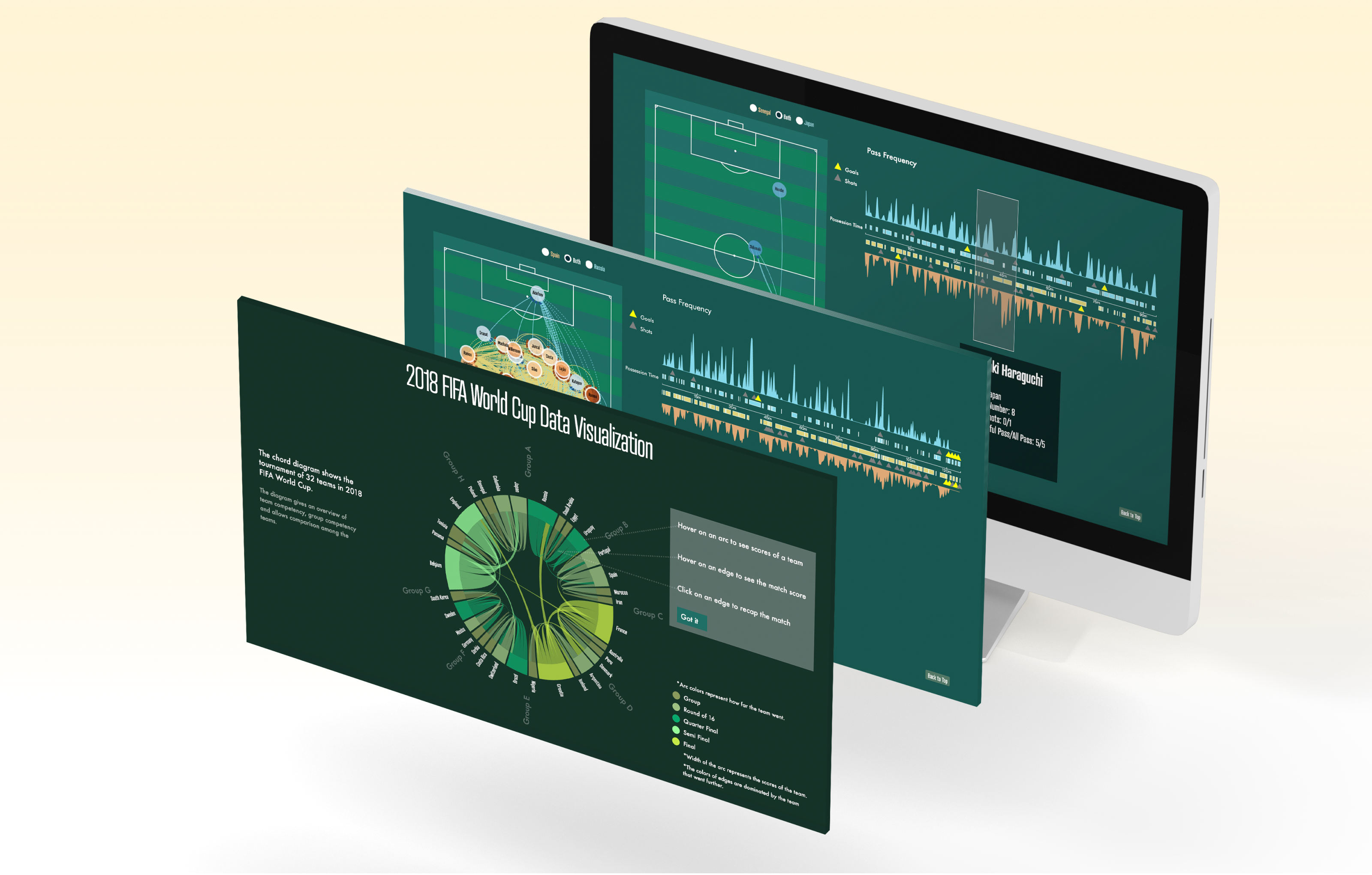
The Final Visualization
My team and I used d3.js to implement my designs, which contain a soccer field diagram that visualizes player movement and a slider that chronologically represents the whole match. The user can look at all player movements, or track the movement of a specific player.
This project was selected as the best student project in our cohort. It also helped my teammates and myself get offers from places like Airbnb, MIT Labs, and Frog.
Understanding Data
A single match already generates too much data for analysis. To help picking which data variables were valuable for our users, we decided to look at the three different personas: soccer fans, coaches, and sports journalists.
Soccer Fans
- Want to know a team’s lineup, formation, rival, and attack rhythm
- Frustrated by the effort required to gather team tactics information from scattered sources

Soccer Coaches
- Want to know player performance and the other team’s tactics
- Frustrated by difficulty in distilling essential tactical information from raw data and messy notes

Sports Journalists
- Want to find dramatic moments and/or trace particular star players’ performance in a match
- But have no time to go through a whole match

Choosing Data Variables
With the three personas’ goals and frustrations in mind, we came up with an astronomical amount of data variables and spent quite some time pondering which ones to select for our visualization (a reduced version below).
| Period | |||
| Possession team | |||
| Duration | |||
| Tactics | Lineup | ||
| Formation | |||
| Player position | |||
| Player | |||
| Under pressure | |||
| Team | |||
| Event type | Block | Offensive | |
| Deflection | |||
| Save block | |||
| Out | |||
| Dribble | Offensive | ||
| Deflection | |||
| Substitution | Off | ||
| On | ID | ||
| Name | |||
| Foul committed | No | ||
| Yes | Offensive | ||
| Not offensive | |||
| Ball recovery | Offensive | ||
| Recovery failure | |||
| Pass | Recipient | ||
| Angle | |||
| Height | |||
| Length | |||
| End location | |||
| Assisted shot ID | |||
| Pass backheel | |||
| Deflected | |||
| Miscommunication | |||
| Shot assist | |||
| Goal assist | |||
| Shot | Key pass ID | ||
| First time | |||
| Follows dribble | |||
| Deadball | |||
| End location | |||
| Open goal | |||
| Redirect | |||
| Freeze frame | |||
| Event location | |||
| Timestamp | |||
| Related events | |||
Picking Visualization Types
Having chosen data variables, the next step was to give them form. We categorized the variables into three big themes and came up with a rough idea of what best represented them:
| Variable Category | Data Visualization Type |
|---|---|
| Player Shows player communication |
Network Visualization |
| Time Allows the user to filter events |
Time Slider |
| Location Displays real-time player position |
Location Visualization |
The time slider was easy, but what type of diagram should we actually choose for the network and the location visualizations? We looked at different types of diagrams and compared their pros and cons.
Network – Arc

Looks cool when there’re a lot of connections
Not space-efficient enough to show all 22 players
Network – Alluvial

Space-efficient enough to show all 22 players
Form is more suitable to display rivalry than collaboration
Network – Matrix

Looks cool and space-efficient too
Data points start getting repetitive fast, making it hard to read and distill insights
Network – Chord

Looks cool, space-efficient, provides overview, and can still show player interactions
Not really
Location – Heat Map

Maps event frequencies to location well
Doesn’t allow discerning single player movement or events
Location – A Literal Soccer Field

Provides overview of event frequencies but still capable of showing single player movements or events
Not really
We decided to go with the chord and the actual soccer field diagram, as they didn’t have significant shortcomings like the others.
First Attempt
Though we had chosen the appropriate types of visualization, it was still no small feat to combine them in a sensible way. We quickly made our first design:

During critique, we realized that it was too narrowly optimized for showing individual player locations, and was unfit for displaying other metrics like team tactics. It was also formally disjunctive: the two orbs on the right and the soccer field on the left weren’t visually connected, making the reader spend too much effort to understand it.
(Re)introducing the Time Slider
To establish a clearer connection between the teams and the soccer field diagram, we brainstormed and decided to replace the orbs with the time slider, which was originally on top of the soccer field.
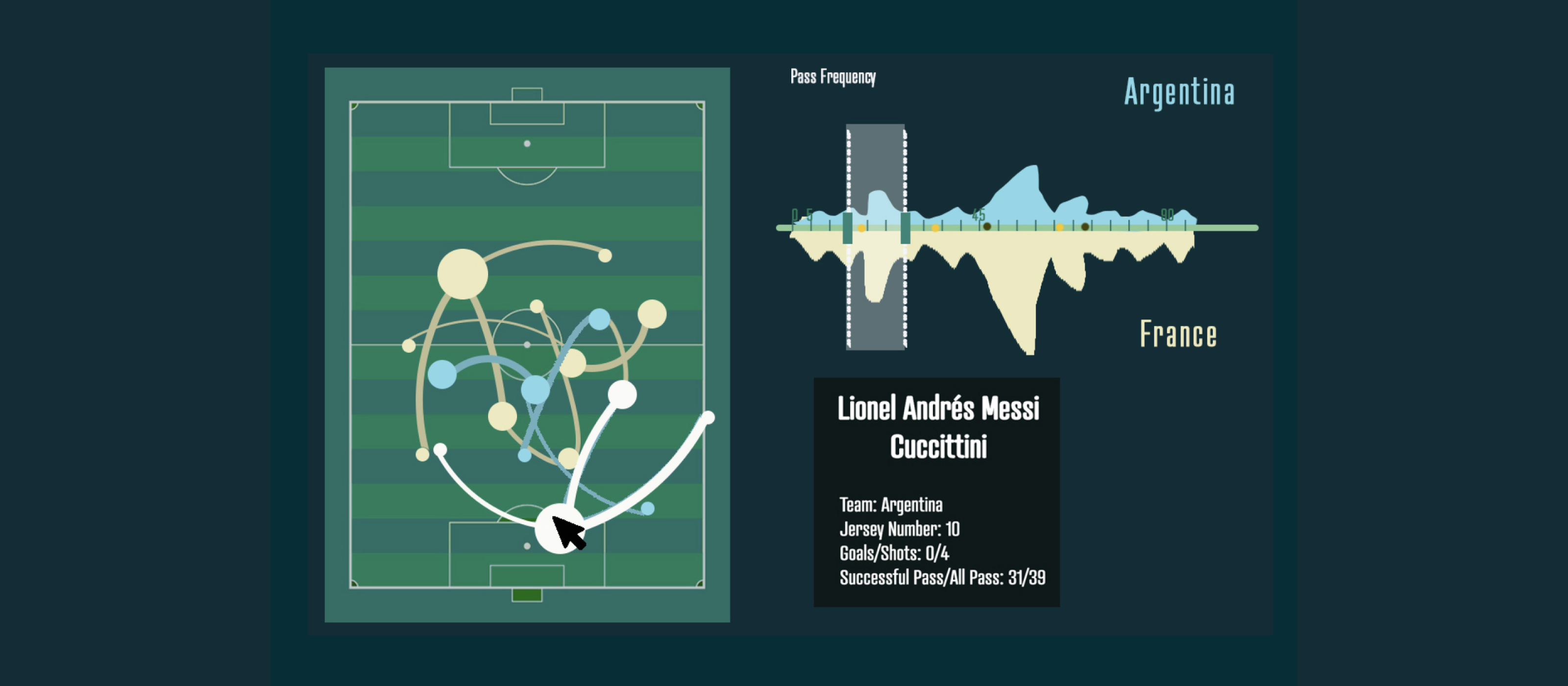
Not long after we made the decision, we also stumbled upon a small piece of UI on Airbnb that visualizes housing prices according to a user-selected time frame. This immediately inspired us to do the same to our time slider by adding pass frequency.


Pass frequency turned out to be a powerful dimension that immediately transcended the time slider, pulling the two pieces of visualization together. It alone could help users deduce team tactics. When combined with time, it naturally guided the viewer’s focus. More fantastically, on an overall level it established Brush-and-Linking, which allows the user to truly see the same match in different yet simultaneous perspectives.
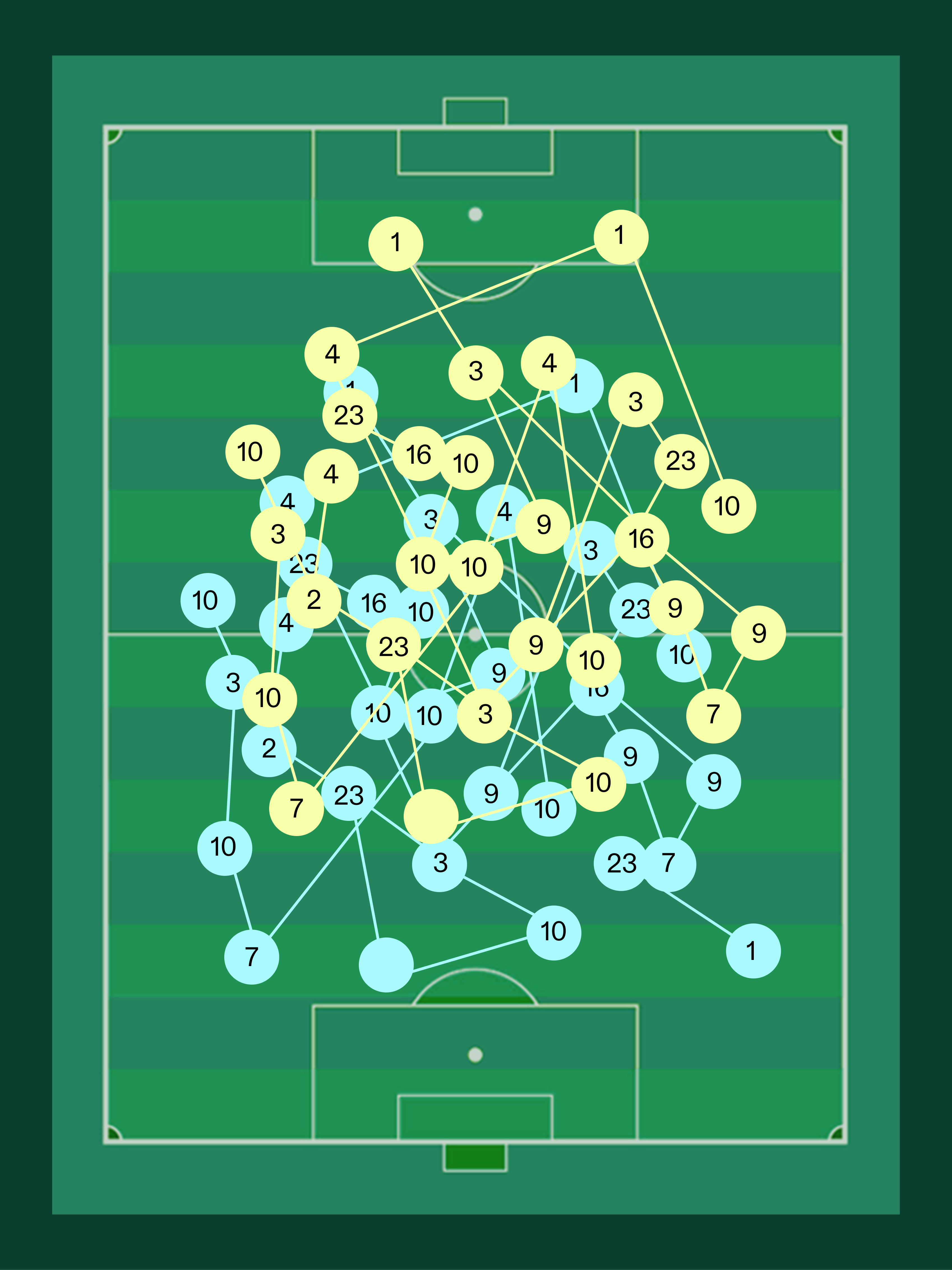
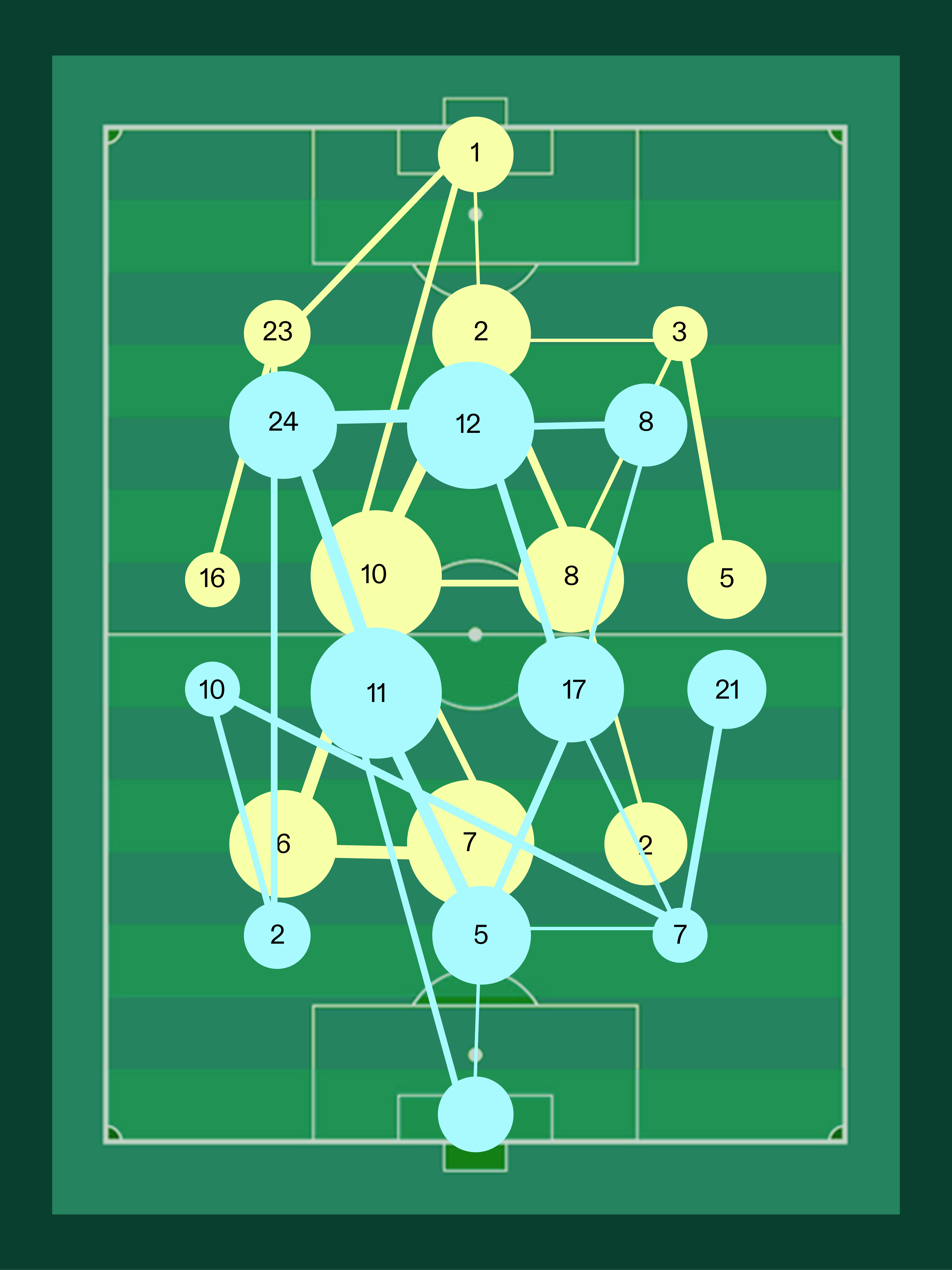
Addressing the Hair of Strings Problem
With the time slider taken care of, we moved on to implementing the soccer field diagram. However, showing player positions throughout a match presented the classic Hair of Strings problem: data is so dense that the visualization became almost impossible to read. We had a long debate, and arrived at the decision to average each player’s positions using a set moving timeframe.
A/B Testing the Navigation Portal
In designing the navigation portal, I analyzed the pros and cons on traditional tournament views and dropdown lists. These two forms have significant flaws: they make precise-searching a match difficult, and often show repetitive, redundant information. I used chord diagrams, which allow quick precise-searching and show less redundant information. I specifically A/B tested for arranging taems in alphabetical order or group order, each of which has specific advantages and disadvantages.


I conducted A/B testing with three of my soccer fan friends who have watched soccer for 6 months, 3 years, and 10 years, corresponding to the three user personas described above. They were asked to find the Argentina-France and the Spain-Portugal matches, measuring completion time and verbal preferences. At the end, although the completion time was roughly the same on both versions, they all preferred the group order version for its resemblance to the tournament layout.
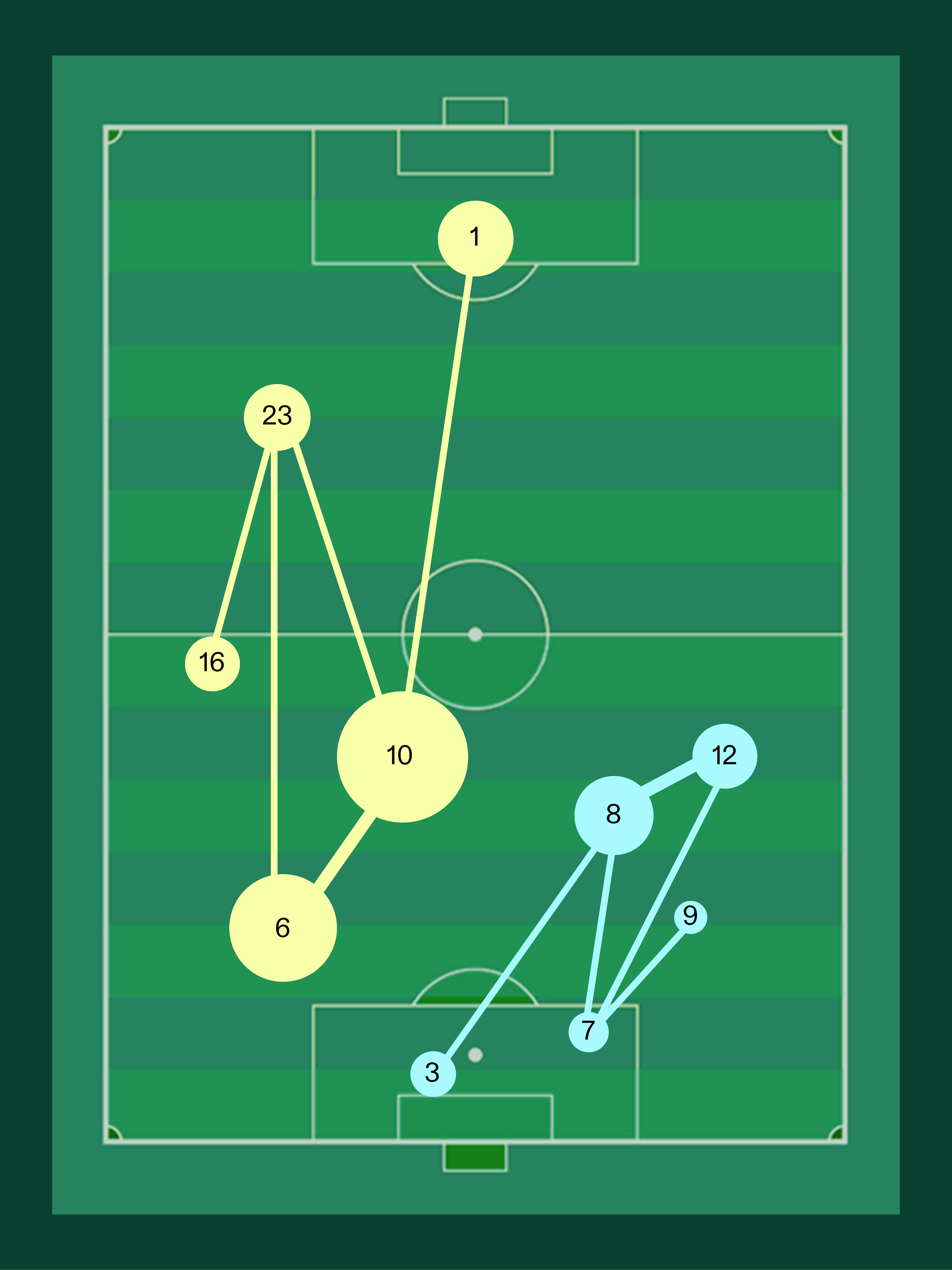
Live Site with Real Data
To demonstrate how the finalized tool would be used in context, below is the Spain-Russia quarter final. Even without seeing the legends, soccer fans or coaches can still easily tell Spain (yellow) from Russia (blue) because of the consecutive and short distribution chart over the time slider together with long possession time.


Play with the live version here.
Conclusion
This project made me think much deeper than before about the pros and cons of specific types of data visualizations. More importantly, it taught me an important lesson about effectively communicating with developers to respond to technical reality, schedule pressures, and how designs would look like when animated with real data.