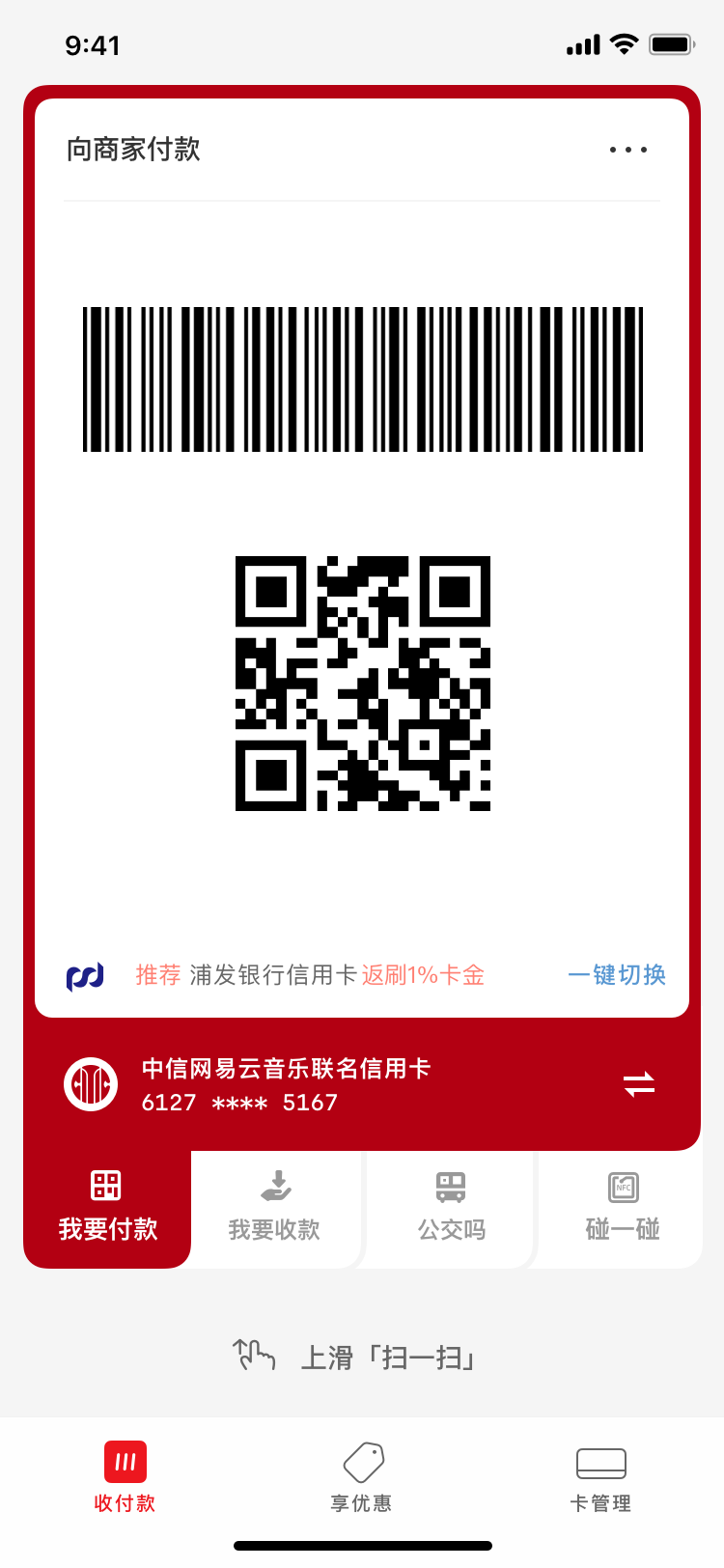
Scan to Pay
Mobile payment in China is based on QR codes instead of NFC sensors. One can scan other’s codes, or present his/her own code to be scanned. Different codes allow individuals or merchants to send or receive money. They can be printed at almost no cost—even grocery stalls in a farmer’s market can use them to receive payment.

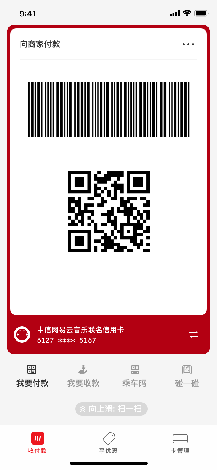
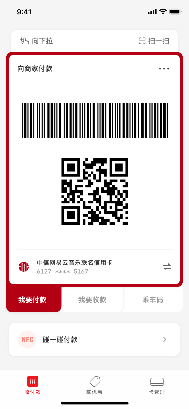
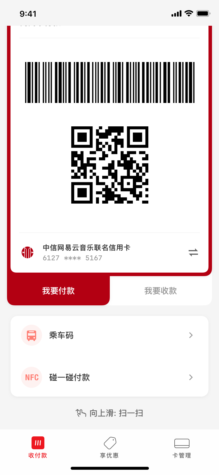
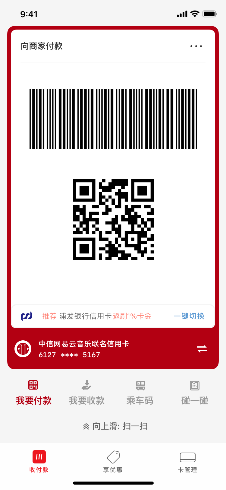
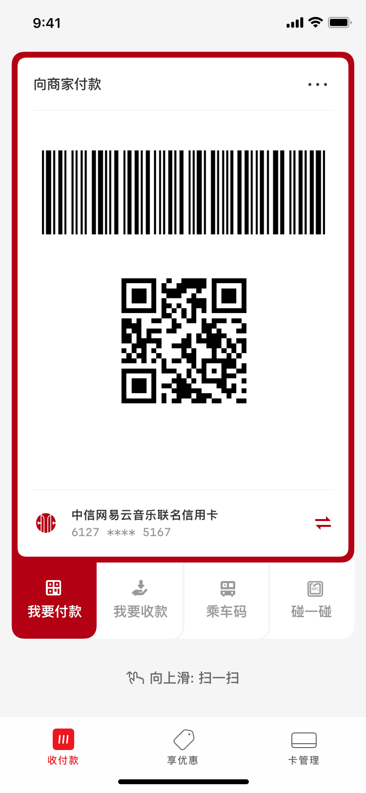
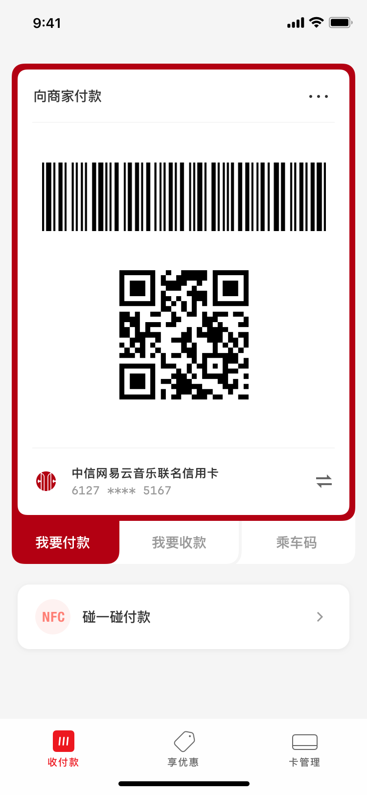
Like many mobile payment competitors, the UnionPay Wallet app carves out an entire bottom tab for displaying and scanning QR codes. Users could choose between sending or receiving, pick different bank cards, switch to NFC mode in poor network conditions, and display codes specific to regional mass transit systems.


- Switch to paying mode (currently active)
- Switch to receiving mode
- Launch OS camera for scanning
- Payment barcode & QR code
- Switch between different bank cards
- Activate NFC mode for POS machines and for offline use in poor network conditions
- Display mass-transit-specific codes
UnionPay, however, were unhappy about this design. They thought it simply looked too much like other mobile payment apps and lacked brand differentiation, which the Wallet app desperately needed, as UnionPay were late to the heated competition already dominated by AliPay and various smartphone manufacturers. The client’s organizational structure posed an additional challenge—deciding on a design through countless layers of approval in a state-owned bureaucratic enterprise was nothing short of a nightmare.
How do we maintain a friendly interface design, fulfill UnionPay’s desire for differentiation, all the while still get it approved by their layers of leadership?
Solution & Impact
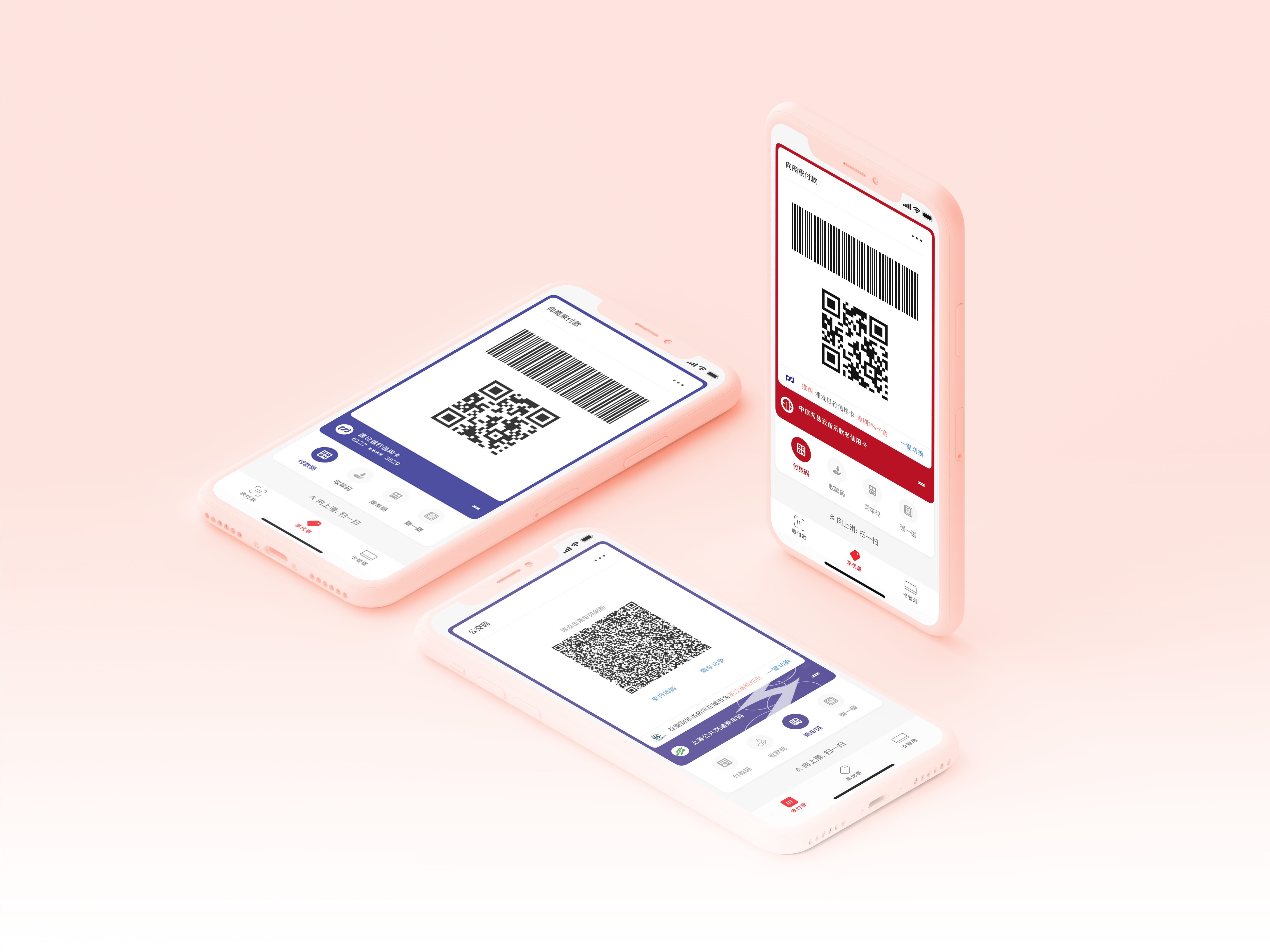
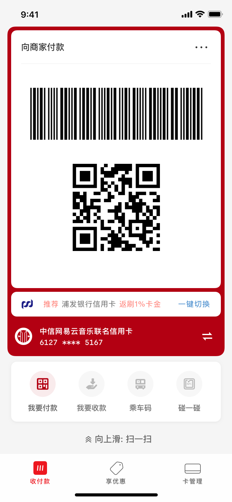
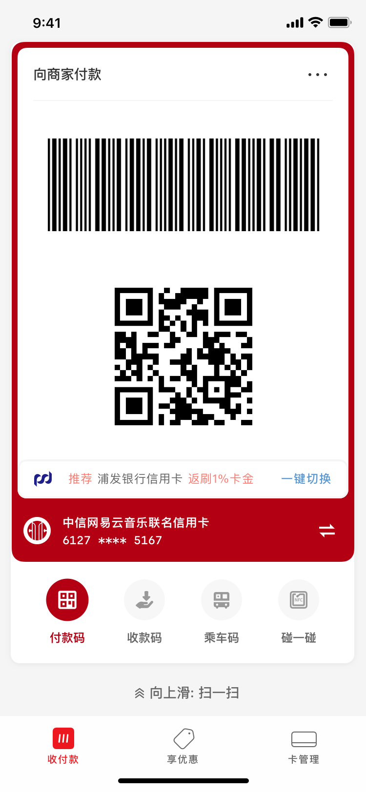
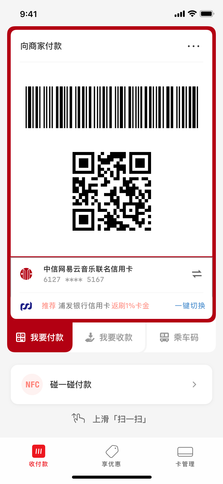
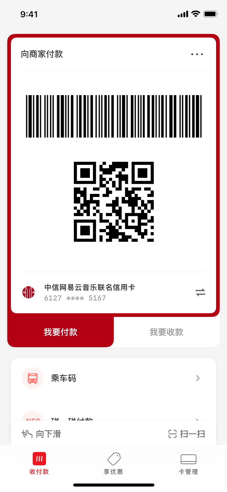
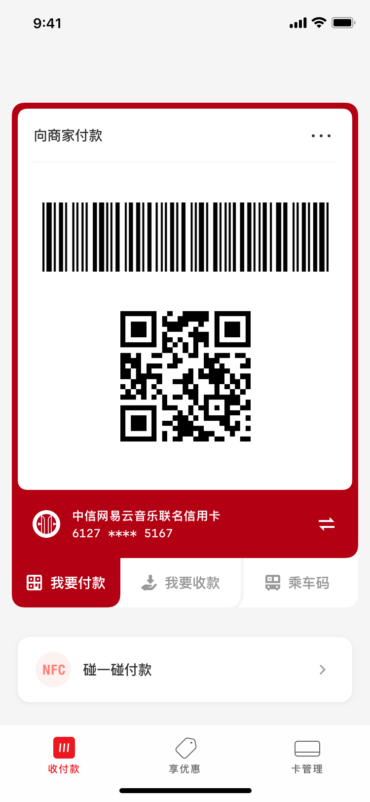
While my senior designer mentors took care of client meetings, I focused on designing static screen mockups and interactive prototypes. Of the over 30 options I produced, one was eventually chosen. While maintaining similarity to the existing design, the new design addressed a majority of the client’s additional asks.
This design is currently being used by the app’s 300+ million daily active users, and significantly contributes to the app’s App Store rating jumping from 3.1 to 4.4 given its crucial status in the overall user experience.


“Leader-Centered Design”
UnionPay’s organizational structure mirrored that of the government: lots of pyramidal leadership layers. It produced three characteristics that specifically impacted our collaboration:
- Members of its leadership were appointed based on their political cedentials, not merit or professional capability; they have practically no idea what design is.
- UnionPay designers prioritized pleasing their superiors over usability and beauty. State-owned enterprises needed not be profitable, so pleasing superiors—not end users—was the primary way to get promoted.
- They also liked to ask us “prettify” their pre-approved designs, since pitching ideas from external contractors like Frog for approval might make themselves look incompetent in front of their superiors (we also weren’t allowed to pitch directly).

The Pre-Approved Design
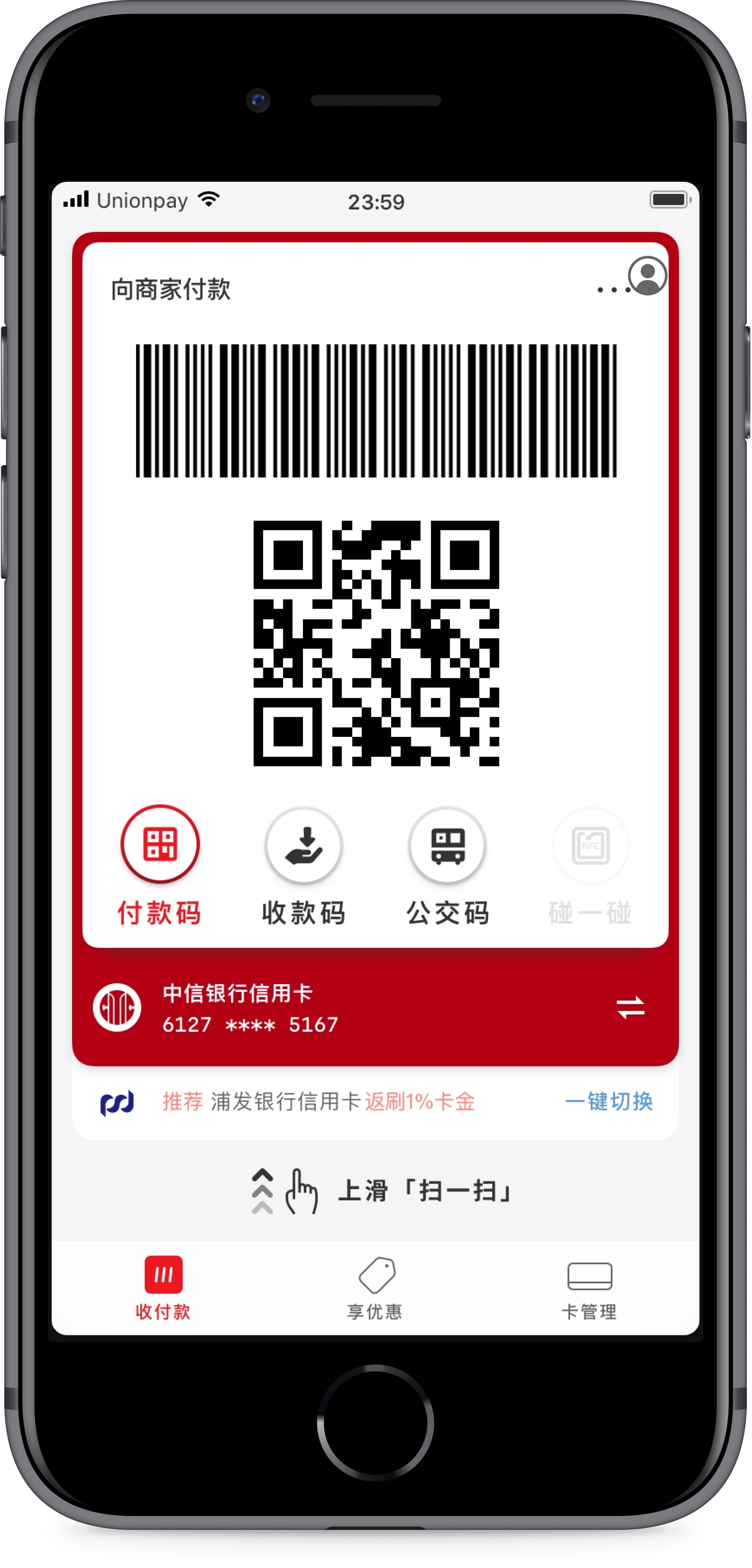
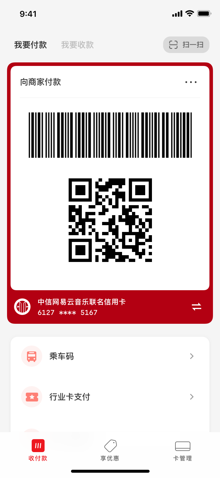
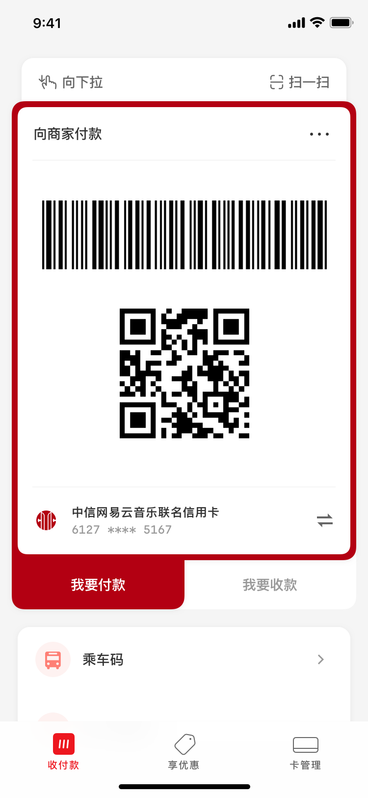
When the project first started, UnionPay designers produced a complete layout and turned the project into a skinning exercise, asking us to simply recreate it with existing design system components. The proposal looked like this:


- Switch to paying mode (currently active)
- Switch to receiving mode
- Display mass-transit-specific codes
- Activate NFC mode for POS machines and for offline use in poor network conditions
- Switch between different bank cards
- An advertisement slot
- Launch the OS camera for scanning by swiping up (tapping the area also works)
Upon first sight, there were already a few significant flaws:
- Tapping the receiving mode button (2) would change not only the codes above, but also the entire container—the frame would change to a blue color, and the bank card selected (5) at its bottom would also change. That is to say content is controlling its container, instead of the other way around.
- By visual placement, this layout implies that the user should select what transaction scenario (paying, receiving, or mass transit) first, then choose an associated bank card to perform said transaction. However, things happen in real life in the reverse order: one would choose a bank card or account before using it to perform transactions.
However, we found out that UnionPay insisted on this design no matter how much effort we spent persuading them. When pressed hard, one of the UnionPay designers finally leaked the truth:
“This has already been approved by 4 levels of leaders.”
At that point, we all realized that the challenge was not to produce a better design, but to persuade the UnionPay designers away from their own leadership-approved one. Negotiation tactics became as important as pixel-pushing prowess. My senior designer mentors and I started devising strategies.
Show Absurdity
Since external exemplaries couldn’t move them, we decided to realize their original request and simply present the ensuing monstrosity, hoping that UnionPay designers would realize their own proposal’s absurdity.
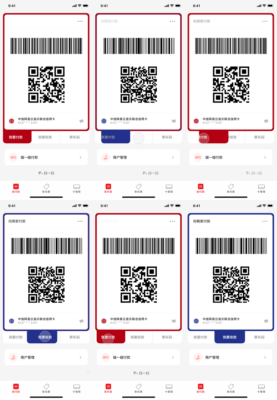
And a montrosity it was—the interactive prototype I made had elements flying around without clear rationale. The entire interface was unpredictable and incomprehensible for new users.
Yet when we presented it to the UnionPay design team, they did not see any absurdity despite our best efforts casting it in negative light.
“This is exactly what we want. Make this.”
Sea of Options
We now realized that UnionPay designers were hellbent on their design and we could inundate them with a sea of options. Using a “protracted warfare” mindset, we thought if we presented enough options over a long period of time, maybe the clients would eventually be worn out and favor one of them. Below are a selection.
Since UnionPay had somehow registered the “swipe up to scan” gesture as a patent in China, I tried to emphasize the scan button (or swipe gesture) by adding background color or changing its placement.


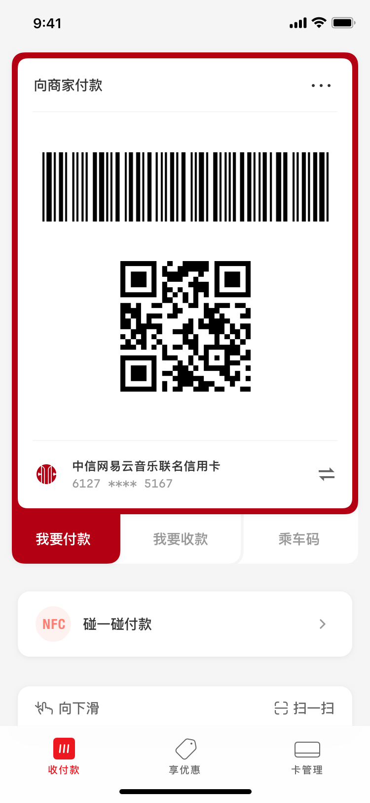
UnionPay didn’t buy them. Since reinterpreting their intentions did not work, we decided to go diplomatic by doing “trades”. We would effectively start giving in on some of their more trivial (nonetheless insidious) asks, if our sacrifice meant they would accept one of our proposals. Below I started exploring different ways to squeeze an advertisement slot into the interface.
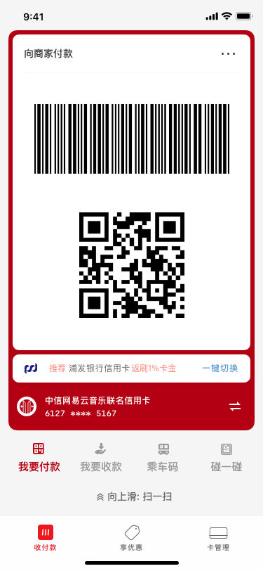
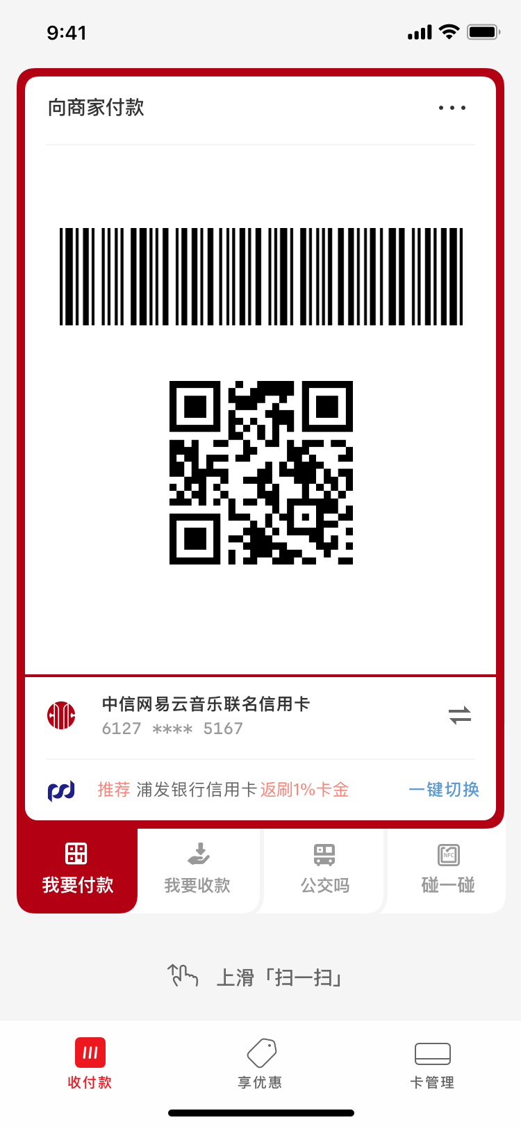
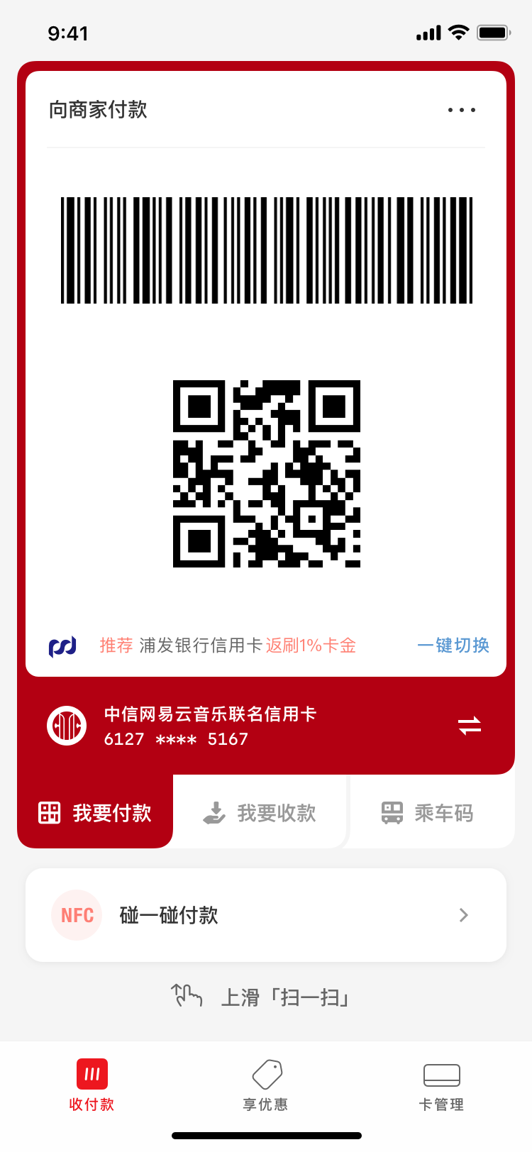
Diplomatic trades did not work any wonders. UnionPay designers welcomed these concessions, yet were unwilling to make any from their side. At this point, we were almost out of ideas and started clinging onto any idea that might be a way out. We started doing pattern analysis on the past options that garnered favorable reactions, and suspected that UnionPay leaders seemed to have a thing for circular shapes…


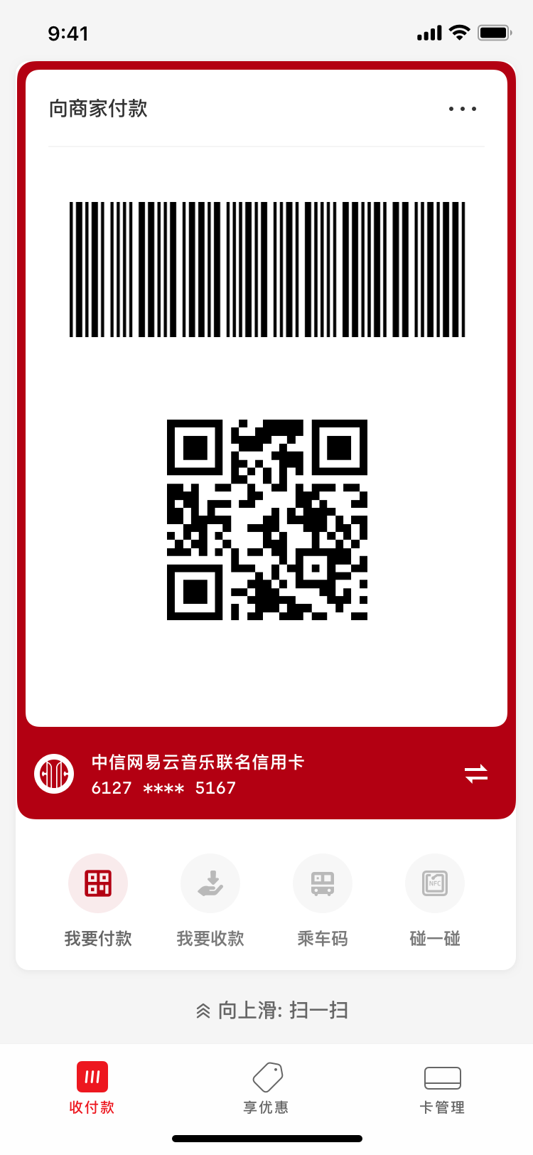
The clients were receptive, but none had a strong “yes” for any of them. At this point, we were truly worn out as this project had been dragged on for almost three months. The team were desperate—what else could UnionPay want?
1 Animated Prototype > 100 Static Mockups
As a learning exercise, I started animating some of the options in Principle. One of my senior designer mentors saw the prototype videos and decided to present one in one of the lower-stake routine client meetings.
Serendipitously, a higher-level leader who wasn’t heavily involved happened to sit in that day. After seeing the prototype video, he mused “this works pretty well—what’s all the fuss about?” The option was approved on the spot in a most anticlimatic fashion.


Conclusion
The Herculean effort we spent on iteration and persuasion taught me a vivid lesson about the design process: any designed artifact reflects the aggregate values of people behind it. At a more operational level, it taught me different methods to persuade and influence as a designer, which I wouldn’t necessarily get from school.
