UnionPay Wallet
UnionPay issues bank cards in China just like MasterCard would in the US. Recently, it has started to expand into transaction processing (like PayPal) and mobile payment (like Apple Pay). The UnionPay Wallet app is its attempt to enter the mobile payment market, which had been dominated by heavyweight competitors like AliPay and WeChat.
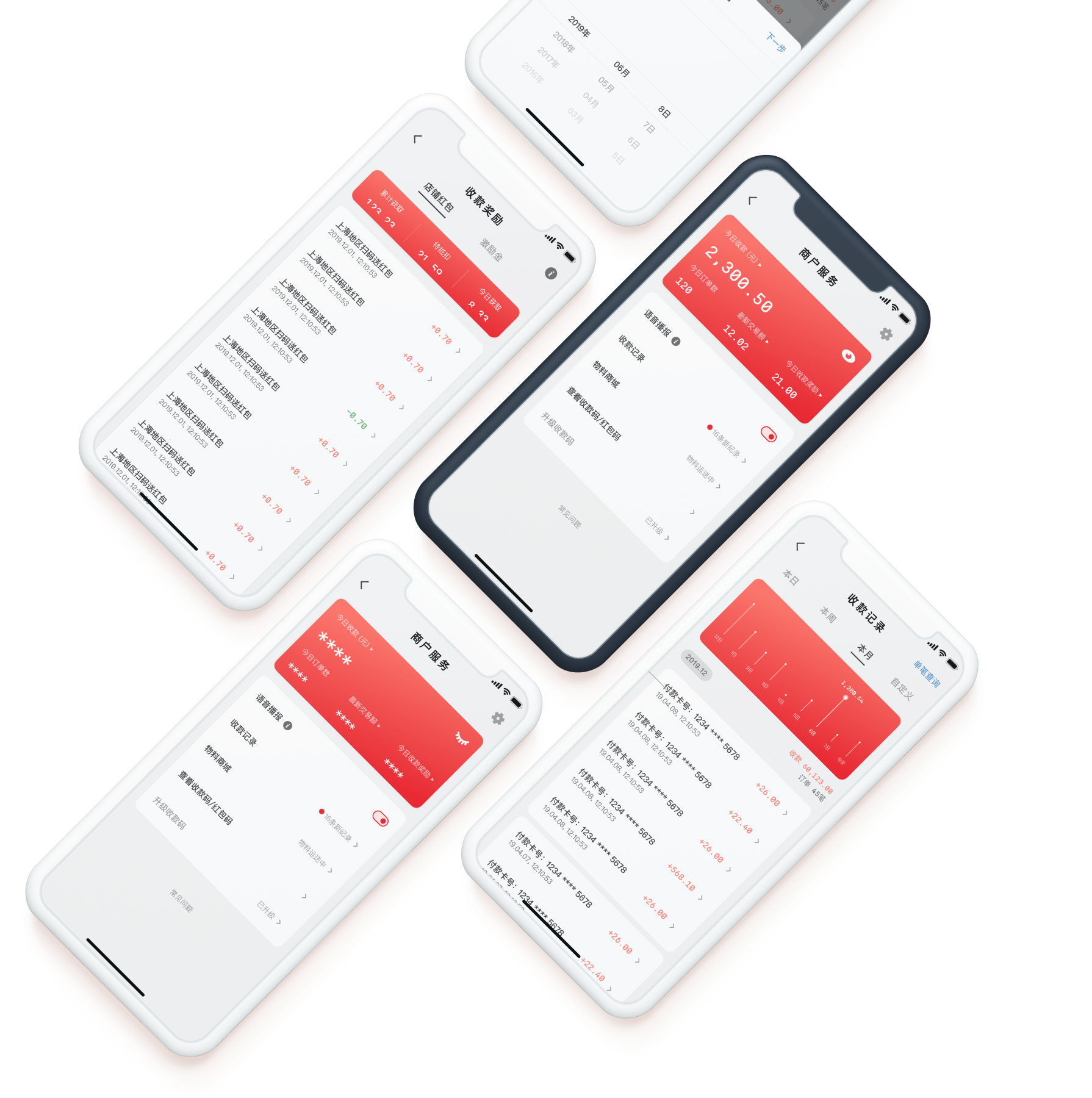
To grow its user base, the UnionPay Wallet app had been giving out cash prizes to small business owners who accept payments with it. The Merchant Portal was where users would see these cash prizes, and where they would find all business-related functionality. Yet despite heavy incentives, user growth and brand loyalty had stalled. How could design help?
How do we improve UnionPay’s ROI on cash incentives given out to small business owners?
Solution & Impact
By clearing up information hierarchy and adding more useful transaction data visualization in the Merchant Portal, investment return on UnionPay promotion has increased since small business owners’ trust in the UnionPay brand was boosted. It has directly attracted more small business owners to sign up as UnionPay partners and provided more transaction scenarios for customers.
6 months after design improvements were shipped, UnionPay Wallet’s DAU doubled to 300+ million, and its App Store review rating jumped from 3.1 to 4.4.
After a few weeks of user research, design explorations, and iterations on my own, I used Principle to package my designs into a prototype.
Existing Merchant Portal Layout
The Merchant Portal hosts a collection of commonly used features for small business owners in their daily operations:
- ordering printed materials;
- receiving customer payments;
- confirming transactions;
- looking at daily transaction overviews after closing.


- Visual notification of new transaction
- Today’s earnings & number of transactions
- Upgrade Receiving QR Code to receive credit card payments
- Merchant store settings
- Purchase UnionPay-branded printouts (e.g. UnionPay logo stickers)
- List of transaction histories
- Display Receiving QR Code
- Placed orders of branded printouts
- UnionPay in-app rebates for merchants
User Problems
After conducting stakeholder interviews and contextual inquiries, my team gathered three biggest problems:
- Small business owners heavily rely on the app’s audio feedback to confirm transactions, but the deeply-buried audio switch made it hard to access;
- Seeing transaction trends is crucial for small businesses to adjust sales strategy, yet there is no visualization of this data;
- UnionPay wanted users to know there are in-app rebates for doing business with the app, but they were difficult to discover.

Personas
After user interviews, we came up with three personas based on age and occupation:
The Shop Mom · 30–50s
- Just wants to do basic stuff like accept payment
- Afraid of breaking things and somehow losing her money
- Needs sense of control and security

The Tech-Savvy Youngster · 20–30s
- Zooms in on transaction data and extrapolate trends
- Power user, willing to explore the rest of the app
- Wants to feel empowered when exploring

The Brand Ambassador
- Hired by UnionPay to station at farmer’s markets
- Helps small business owners troubleshoot the app
- Needs to look trustworthy and professional

Simplifying Information Hierarchy
A clearer, simpler information hierarchy directly benefits both shop moms and tech-savvy youngsters. The Merchant Portal’s existing information hierarchy was too flat, surfacing too many infrequently used functionality without thought. The user had to spent extra effort hunting for the same set of functionalities. I did mainly two things:
- Introduce more depth. Bury infrequently used functionality under sub-menus and detail views, clearing up the top level hierarchy to allow quicker scanning.
- Break hierarchy when appropriate. If a specific feature is frequently used, let it surface to the top instead of being buried under its logical grouping.


The audio feedback switch was only a simple toggle and used to be buried two-levels deep, but I gave it top prominence since it was the most important functionality in our user interviews. Its importance came from:
- Users are too busy to look at their phones during business hours, let alone physical interaction. Audio feedback thus become their only way of confirming that a customer has paid.
- Not being notified can cause real trouble—some users recall chasing customers down for paying, only to embarassingly realize the switch wasn’t toggled on.
- Surfacing the switch also lets the brand ambassador quickly see audio feedback status when he troubleshoots, since not playing audio confirmation may be due to other external reasons, such as the phone being muted or set to Do Not Disturb.
“A few days ago, a new customer bought a pair of scissors when I was copying a key for another customer, but I didn’t hear any payment confirmation from my phone. I chased after the customer, who was confused and showed me the e-Receipt. It turned out my app’s audio feedback was switched off, and I was so embarrassed.”
Many of UnionPay Wallet’s small business users are mom-and-pop shops who couldn’t afford full-fledged POS terminals from banks. Instead of increasing new customers, they often focus on building rapport with loyal customers. Damaging their long-term relationship because a payment app didn’t work is near unacceptable.


- Merchant Settings
- Total amount of payment received today
- Total number of transactions today
- Amount of latest transaction
- Total amount of cash prizes earned today
- Switch On/Off Audio Feedback
- Upgrade Receiving QR Code
- This Month’s Transactions (List & Data Visualization)
- Buy UnionPay Promo Materials
- Receiving QR Code
- Frequently Asked Questions
The whole interface now had a sense of clarity and order due to better information grouping and proper visual contrast. For the less tech-savvy shop mom, I also took extra care in writing the UX copy, adding status-related secondary text to the right side of the menu items.
Visualizing Transaction Histories
The existing transaction history view’s information density was too high. Visual hierarchy was poor as many elements had equal emphasis and compete for the user’s attention. It also did not present data trends, forcing small business owners to do a lot of mental calculations to project sales trends.


- Time range for viewing transactions: today / last 3 days / last week / last month
- Total amount of payments received today
- Total number of transactions today
- A single transaction, including e-Receipt number, card/account number, amount, and transaction time
To help users better understand transaction histories and make business plans, I prototyped several forms of data visualization.
Line Graph
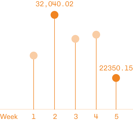
It has all the merits of a bar graph but is visually more lightweight.
Lines require more negative space to tell themselves apart, making them unable to host higher-density data.
Bar Graph

Proven effectiveness and easily understood by most people.
Visually boring; could not fulfill the client’s “be different” requirement.
Calendar

Visually interesting and also easily understood by most people.
Too much emphasis on highest- & lowest-earning dates, sacrificing the ability to project other sales trends.
Area Graph

Really the best around—looks like a bar graph so very understandable; area shape could handle much higher data density (e.g. a year’s transactions).
UnionPay servers could only fetch the last 3 months of data, making it an overkill.
The area graph came in second place after the line graph, and it also had the unique advantage of allowing the viewer to discriminate large amount of dense data (especially useful when viewing yearly transactions). It was eventually dropped because UnionPay’s servers simply couldn’t feed a year’s worth of data quickly enough.


- Lookup single transaction (new feature)
- Left to right: transactions for today, this week, this month (active), or custom range
- Transaction data visualization. Monthly comparison shown; will not display if time range is set to today
- Today’s date
- Today’s total amount of payment received & transactions conducted; will not display if time range is set to today
- A single transaction, showing card number, transaction time, and amount
- The previous days’ transactions are grouped in separate areas below
Single Transaction Lookup
Just as illustrated above, one of small businesses’ persistent pain points was the awkwardness in asking a customer for payment confirmation. It’s embarassing and trust-damaging when the owner accuses the customer of basically stealing and the customer proceeds to show proof of payment. And yet, these incidents regularly happen as payment audio feedback could be inadvertently turned off. To mitigate this issue, we offered a quick way to look up single transactions on the app.
Wrapping it Up
For the low tech-literacy shop mom, a layout with stronger visual hierarchy and clearer copywriting can be more reassuring. For both the tech-savvy younger shop owners and the UnionPay brand ambassadors, our improved info architecture makes it easier to discover new features and merchant rebates, as well as quickly trouble-shoot problems. Whereas all users previously had to do much mental math to project sales trends, the newly added data visualizations would be of great help.
We conducted follow-up interviews after the designs were shipped, and I was proud to find that small business owners felt the Merchant Portal was much easier to use.
Conclusion
The uniqueness of UnionPay lies in it being a mediator between small businesses and their customers, both of whom our target users. Designing the Merchant Portal made me think deeper about the software product vis-a-vis all the stakeholders involved. In this case, a user-friendly app empowers small businesses, makes their customer happier, and eventually boosts UnionPay’s reliable image in both small businesses’ and their customers’ minds: a win-win-win situation.