The Credit Portal
Credit is a core feature of AMC, a centralized web dashboard from which all Marqeta’s feature offerings can be accessed. Depending on services purchased and business partnership, the AMC dashboard allows access to different features. The Credit Portal serves credit-card-issuing partners, e.g. Deserve, who could then create credit card promotions and manage their customers.
How might we empower agents to act on customer requests accurately and efficiently?
Solution & Impact
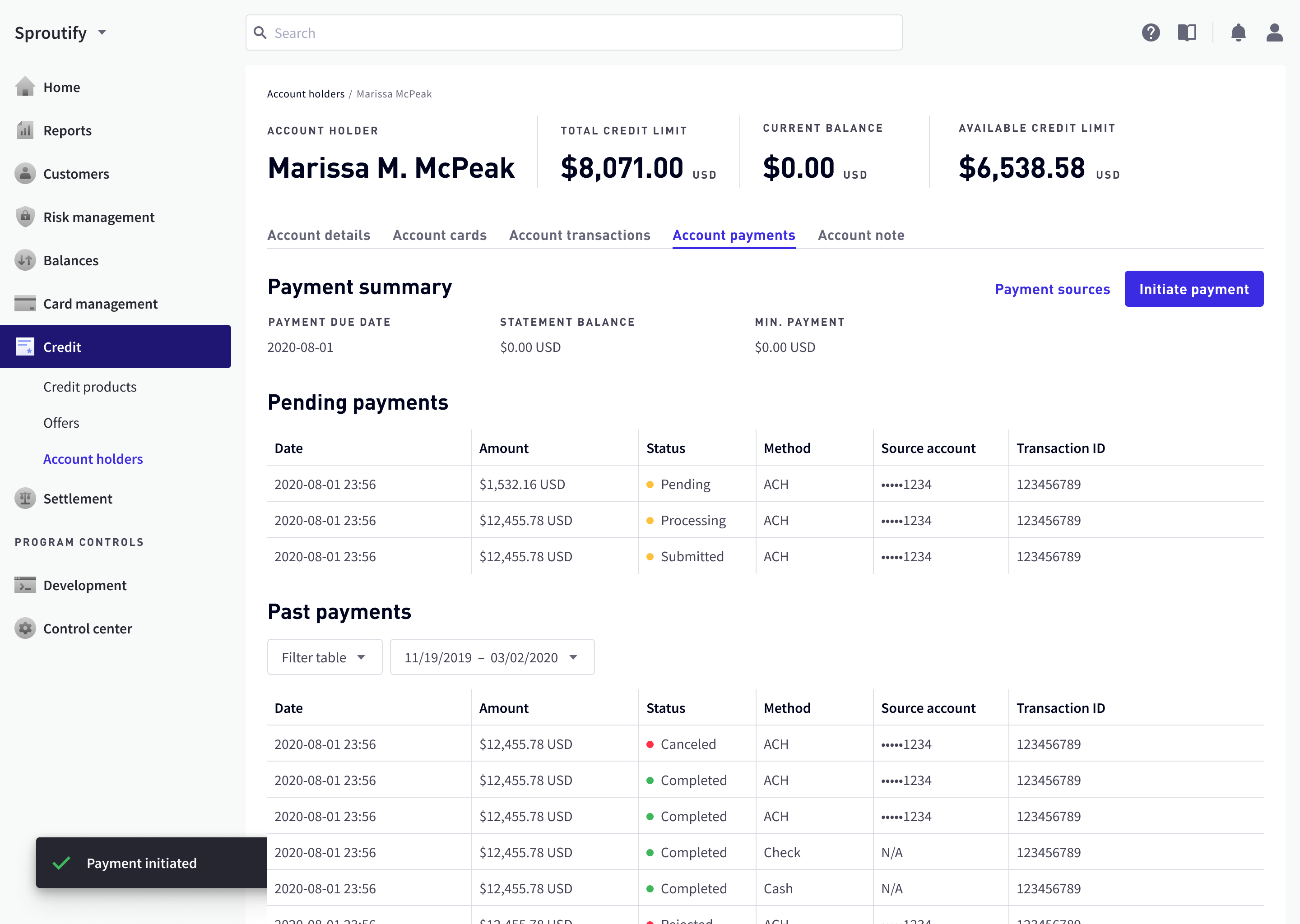
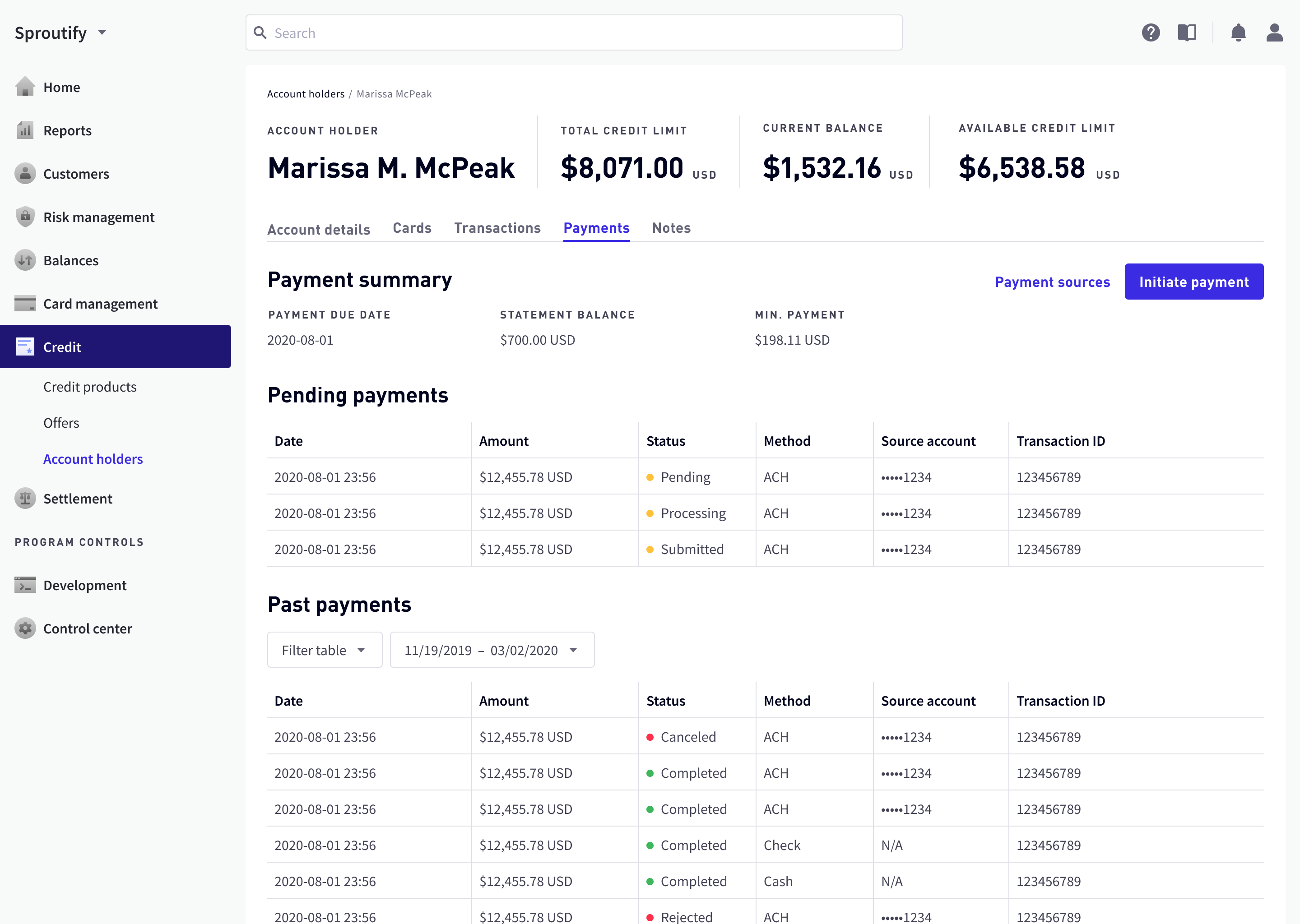
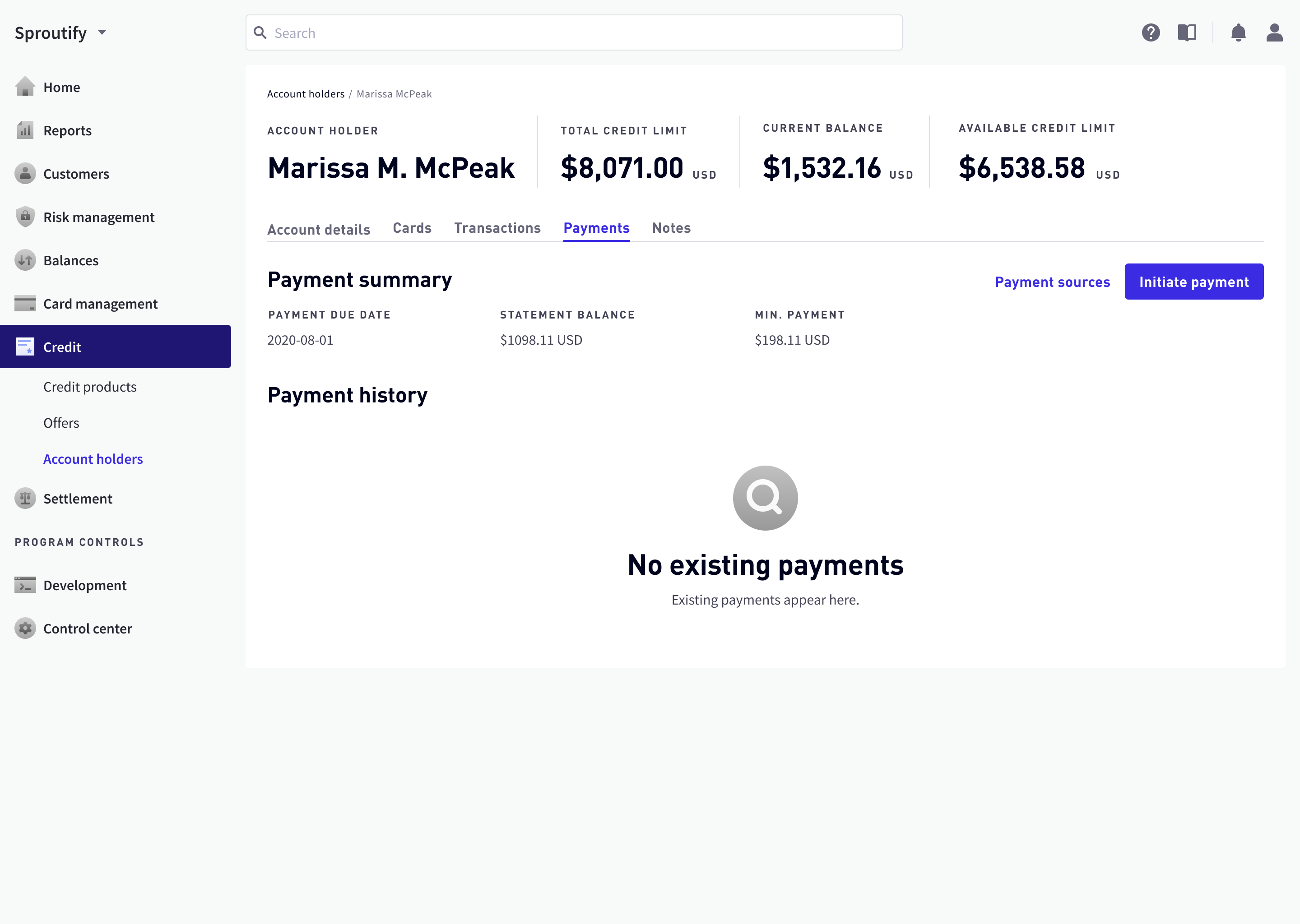
Any credit-related product likely includes payment features, telling the user how much is owed and how he/she can pay. I worked on the AMC dashboard’s payment feature from scratch, including user research, user flows & wireframes, low-fidelity prototypes, and high-fidelity screens. Weekly design sprints included two review sessions with the lead designers and two more with the entire credit product team.
This feature is set to be launched by October 2020. By then it will be:
- reused by other functional teams at Marqeta, most notably the digital banking team;
- widely used by all banking partners of Marqeta such as Deserve and Branch.
Kickoff Session with PMs
During my kickoff session with product managers, I received a rough draft of the user flow and we decided on the following four key features of the Credit Portal:
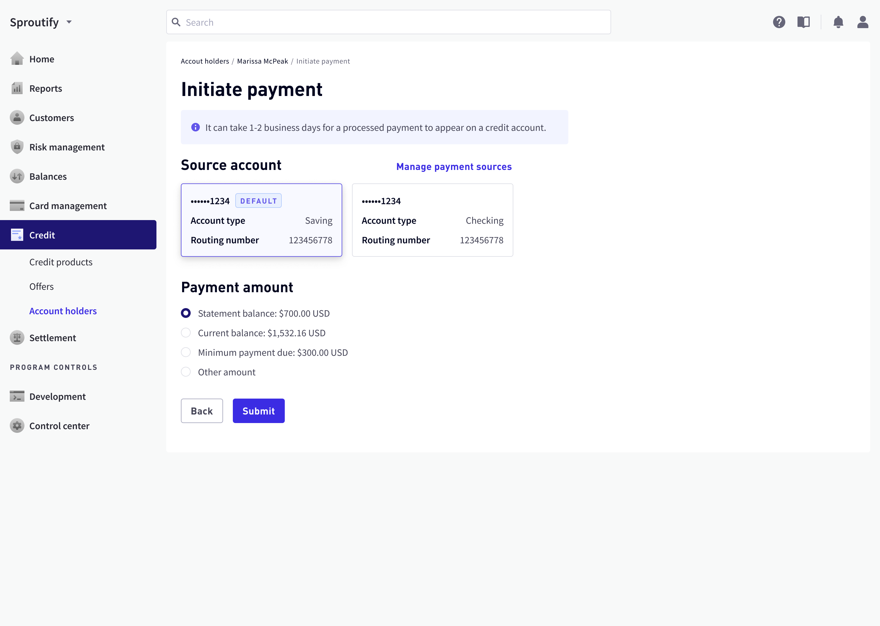
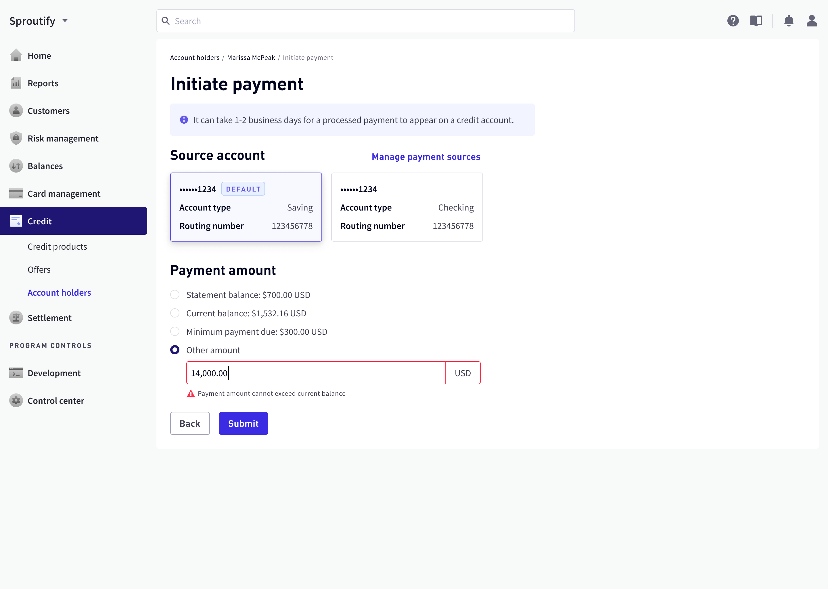
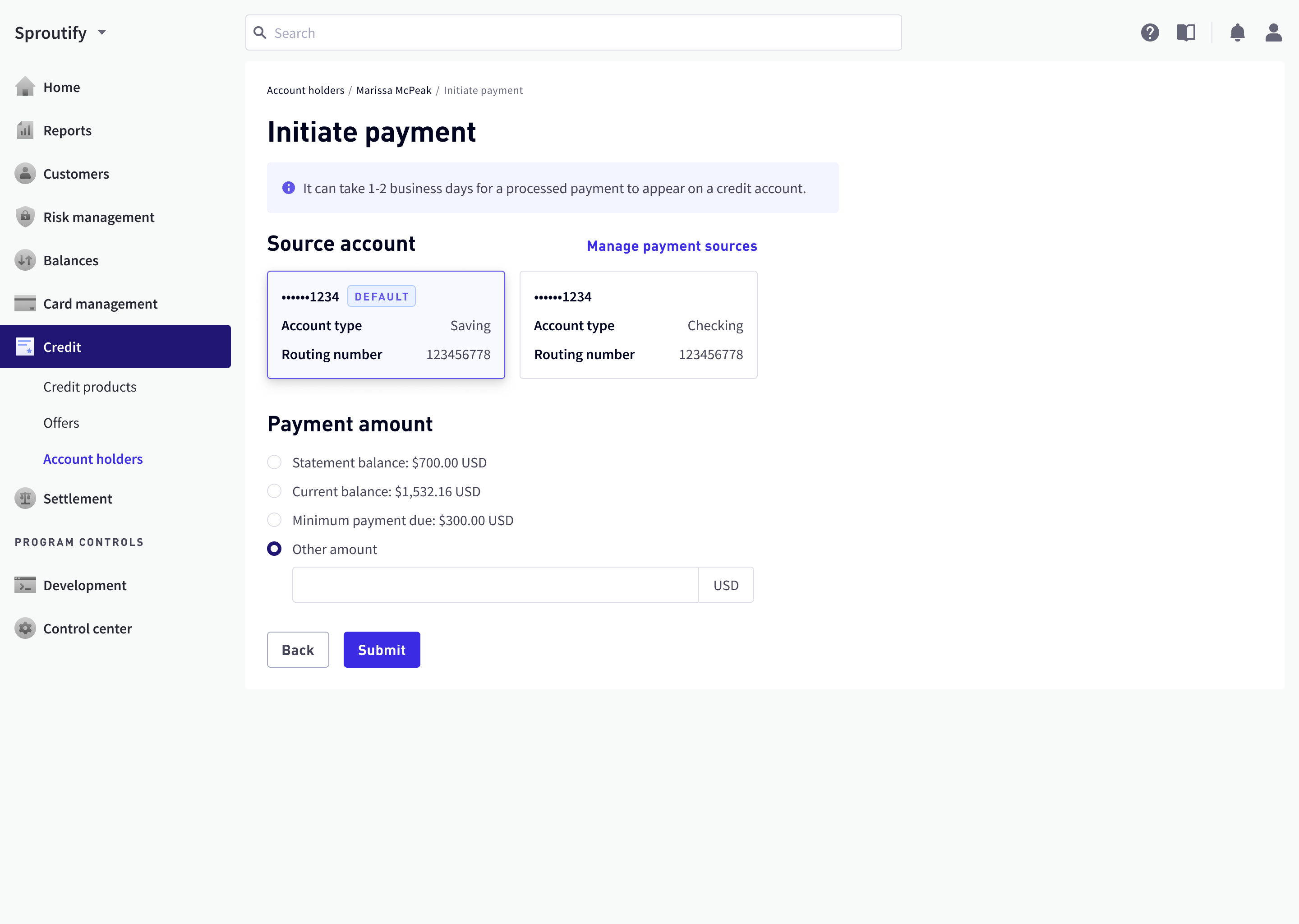
- Initiate payment;
- View, cancel, or refund payment transactions;
- View or remove payment accounts;
- View payment summary information.

Deriving Design Principles from User Interviews
Before committing immediately to the PMs’ user flows, I felt like I should more deeply understand users’ needs and pain points, so I conducted user interviews with credit card support agents as well as other technical stakeholders. These interviews’ insights helped me derive guiding principles to devise a fuller, more user-centered user flow.
| Interview Insight | Design Principle |
|---|---|
| Agents do two things most: locate and accurately act upon payment | Assure information intake accuracy |
| Most customers ask about “how much is due, at what time?” | Keep agents focused on primary tasks |
| Customers often feel insecure about disclosing financial information | Safeguard key financial information |
| Customers prefer calling a human agent over looking up information on an app | Help agents retrieve information faster |

Critical Fixes in the User Flow
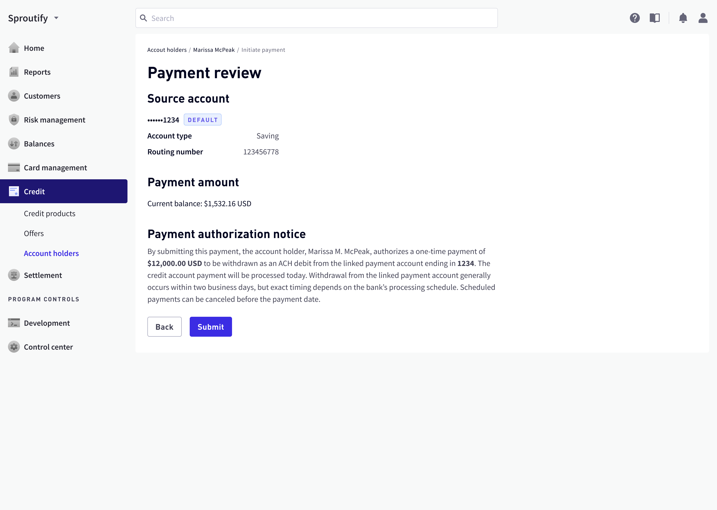
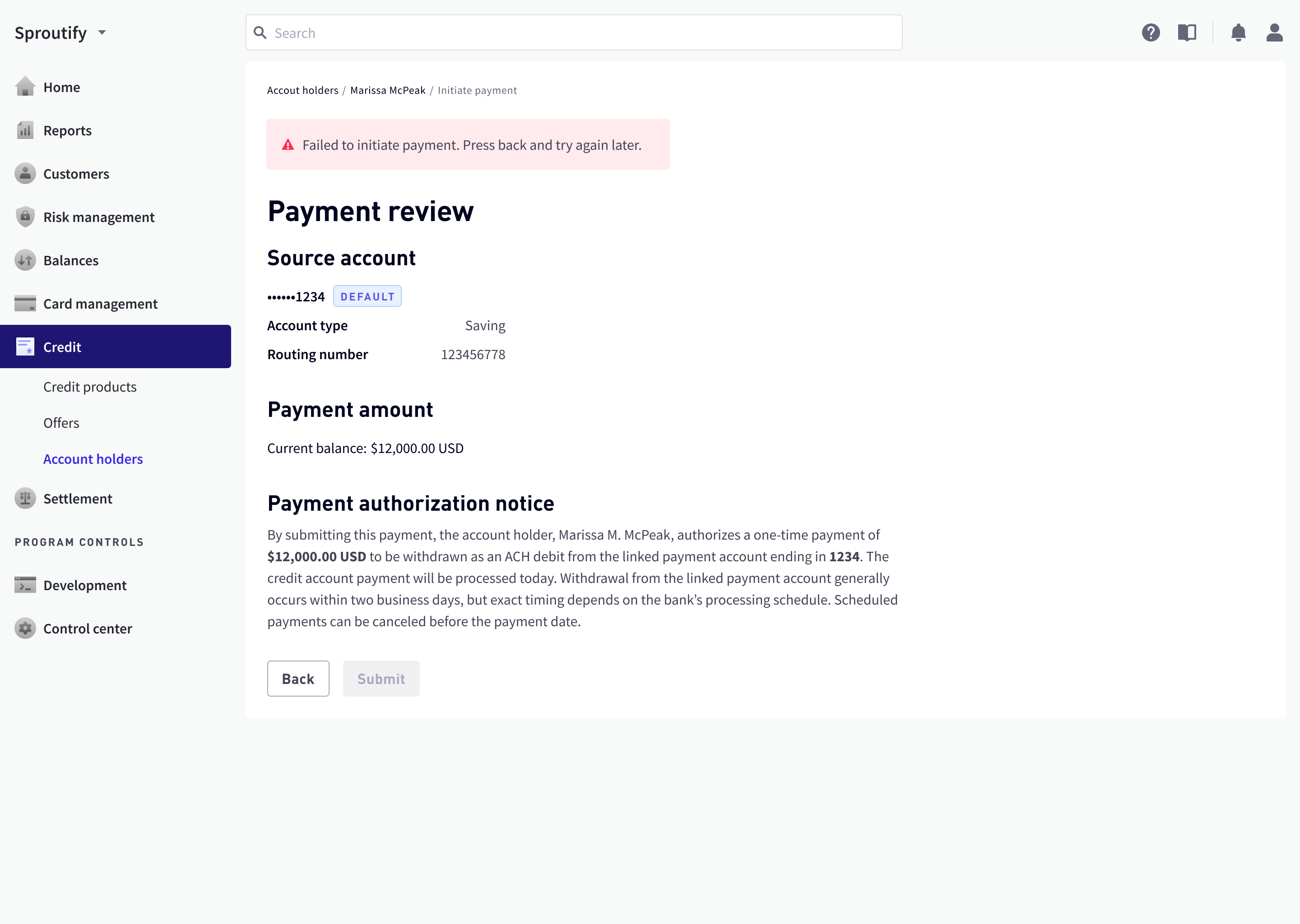
While improving the user flow, I also stumbled upon and proposed fixes for two significant loopholes. The first one was error handling: no established procedure was defined when a data request fails, whether it’s cancel transaction, refund, or initiate payment. I devised one that focused on reducing panic in the agent and customer.

The second loophole had a bigger impact on the calling customer’s experience. Before committing to a credit card payment, the agent usually reads back to the customer a payment summary to confirm, but its content was missing. I designed a content guide according to what customers asked the most in agent interviews.

With information architecture firmly in place, I started doing some low-fidelity design iterations.
Landing Page Layout Directions
The landing page had 4 chunks of user task-related information. To minimize engineering efforts and reduce agents’ learning curves, I picked respective pre-built components from the Marqeta design system library.
| Information Chunk | Respective Component |
|---|---|
| Payment summary | Detail pages (e.g. from a list item) |
| Payment accounts (design for up to 3) | Cards |
| Payment histories | Tables or Accordions |
| CTA for initiating payment | Button |
I came up with several directions for arranging these components, some featuring data visualization and some exploring multi-column layouts.


Tables vs. Accordions
Tables were used in the rest of the AMC dashboard for displaying transaction histories. However, it came with severe, even at times unreasonable restrictions:
- In the implemented design system, they only came as full-width and were not responsive, necessitating horizontal scrolling;
- Without horizontal scrolling, the table item was not wide enough to accommodate all the payment details without modals or additional detail pages. They also posed their own problems:
- Modals are inherently highly disruptive. What’s worse, in implementation they could not host additional CTAs like “remove” or “cancel” for inexplicable reasons;
- Detail pages are meant for high-volume detail information, yet the additional information from a table item was so little that a dedicated detail page felt overkill.


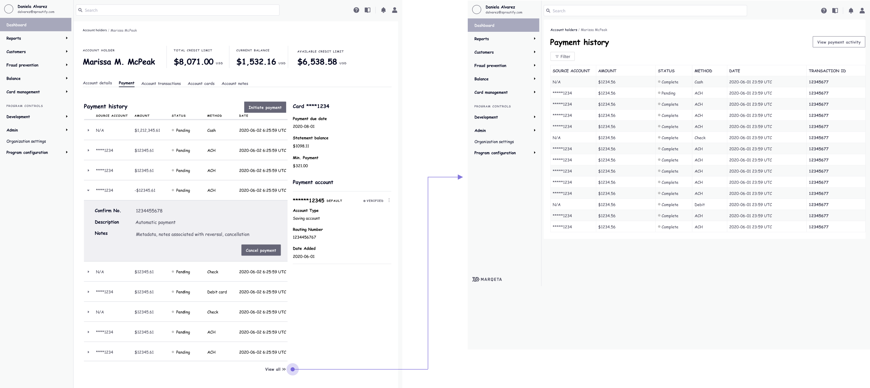
I proposed that we should use accordions, but each accordion item took up too much vertical space. That got me thinking: what if I could modify the accordion component so it has higher information density?

The whole team loved this accordion design since it provides a more elegant alternative to the table component’s restrictions:
- It conformed to the current design system more than a standalone accordion;
- It avoided a modal or a detail page;
- It had flexible, responsive widths that didn’t need horizontal scrolling;
- It could collapse, saving vertical space.
More Nuance in Payment Histories
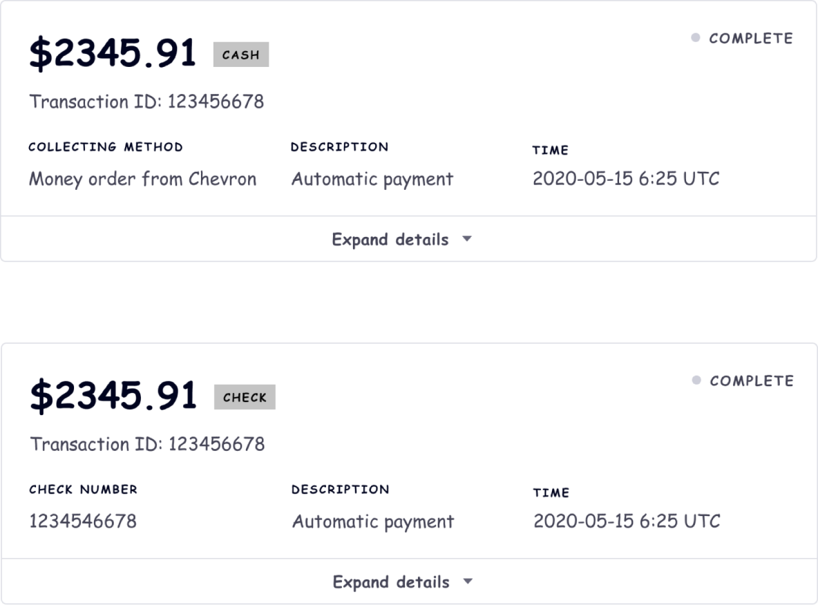
Just when I thought we were ready to move to high-fidelity mockups, we had another stakeholder interview with a PM whose team would reuse this payment feature. He mentioned that his team would need to display payment histories with other payment methods (such as cash), but the current feature scope only accounted for ACH, or direct bank transfers.
Given the fact that over 90% of all transactions in the credit portal were through ACH, supporting other payment methods was clearly low priority. At that point, I also only had less than a week before the hand-off deadline. Nonetheless, my PM thought it’d be nice to accommodate this ask.
“It won’t affect your current design.”
Without design consideration and additional engineering, neither the table nor my accordion design could address the different associated properties of each payment method. A payment made with cash does not have an account number, while a cheque payment needs to surface a cheque number. I explained in excruciating detail about why it very much affects my design, and she eventually agreed to postpone.
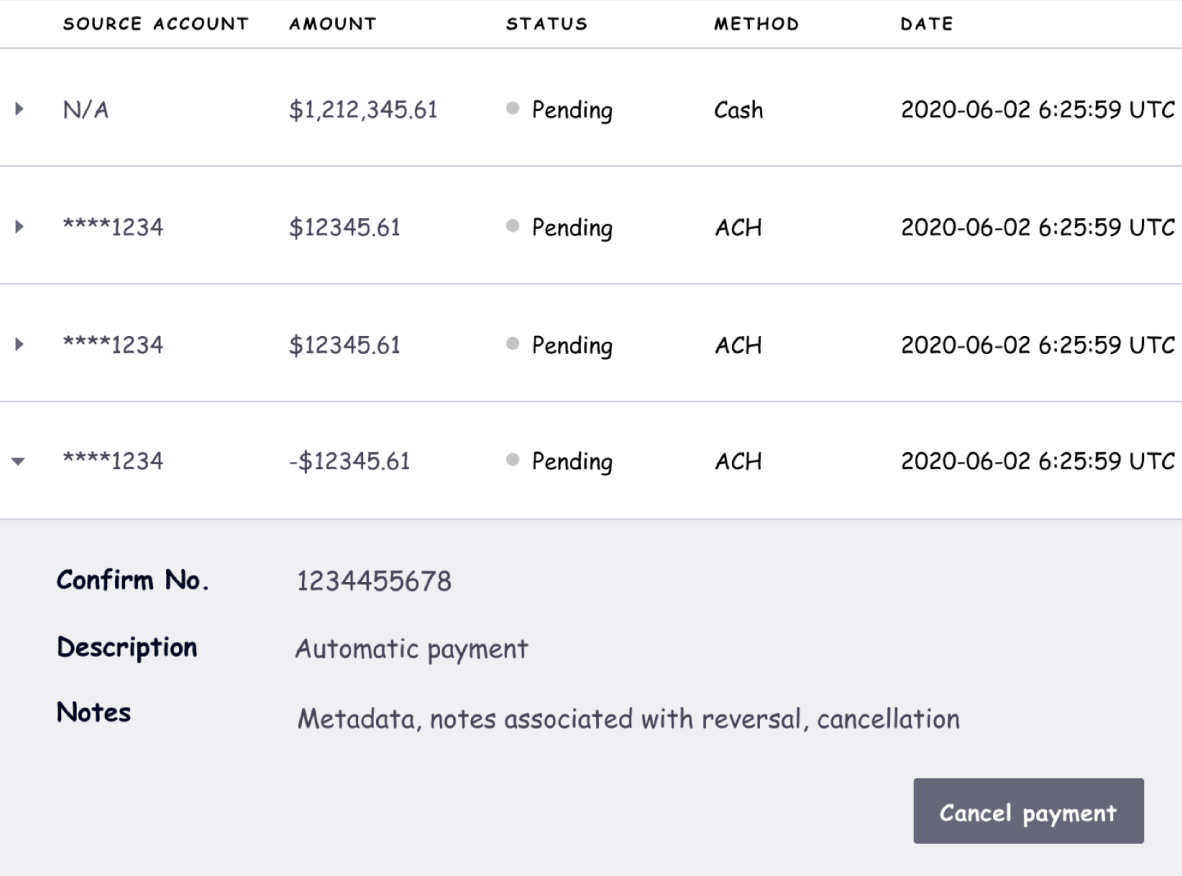
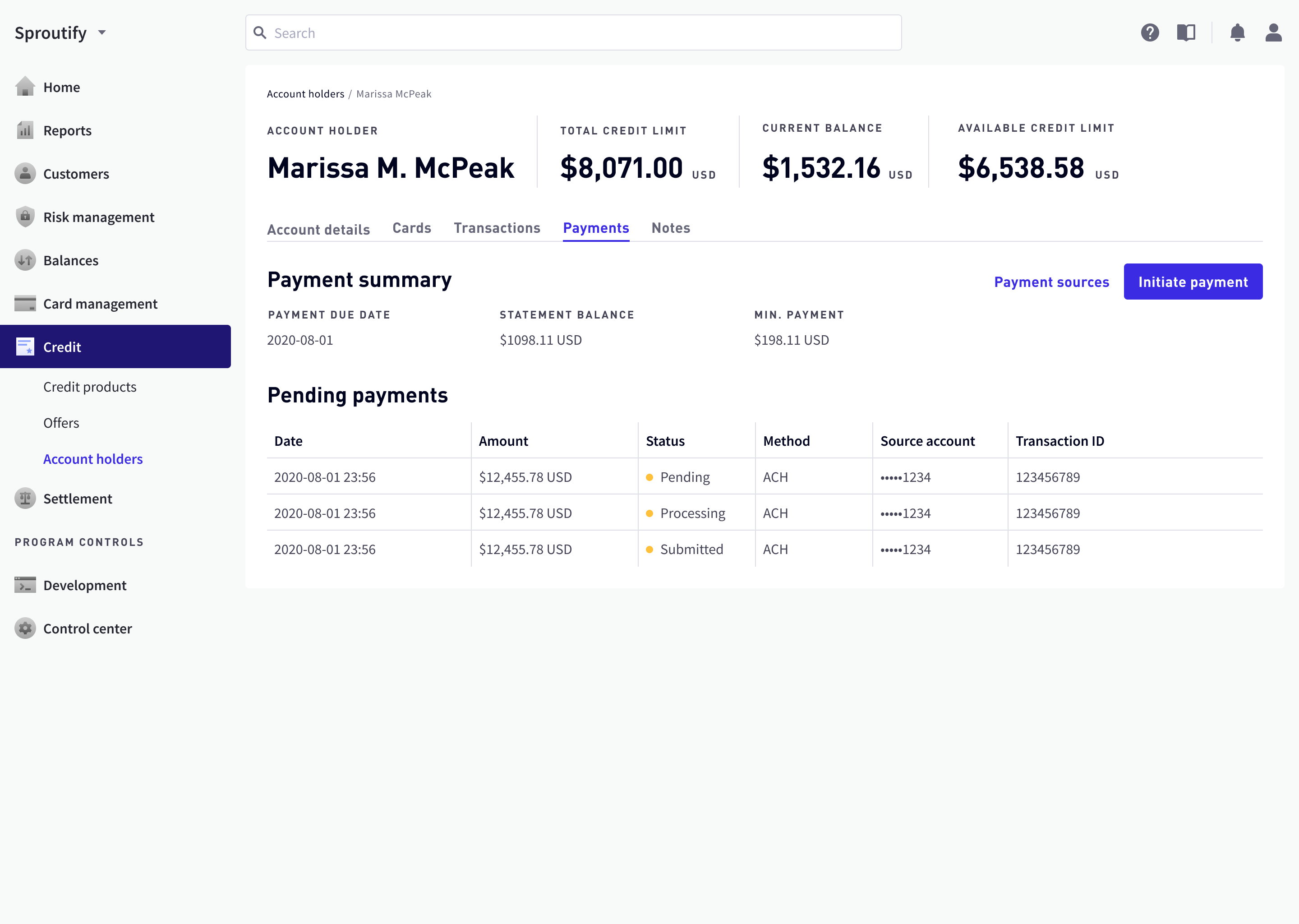
High-Volume Transaction Histories
A new round of design lead review brought up a new issue: hundreds of payment transactions were difficult to locate in the accordion design because (again, for inexplicable reasons) accordion items could not be filtered. Though customers generally pay once a month, the number of transactions could still be in the hundreds for a long-time customer.
I proposed a light amendment: accordions only display recent transactions, while an “all transactions” button lead the agent to a dedicated table page.
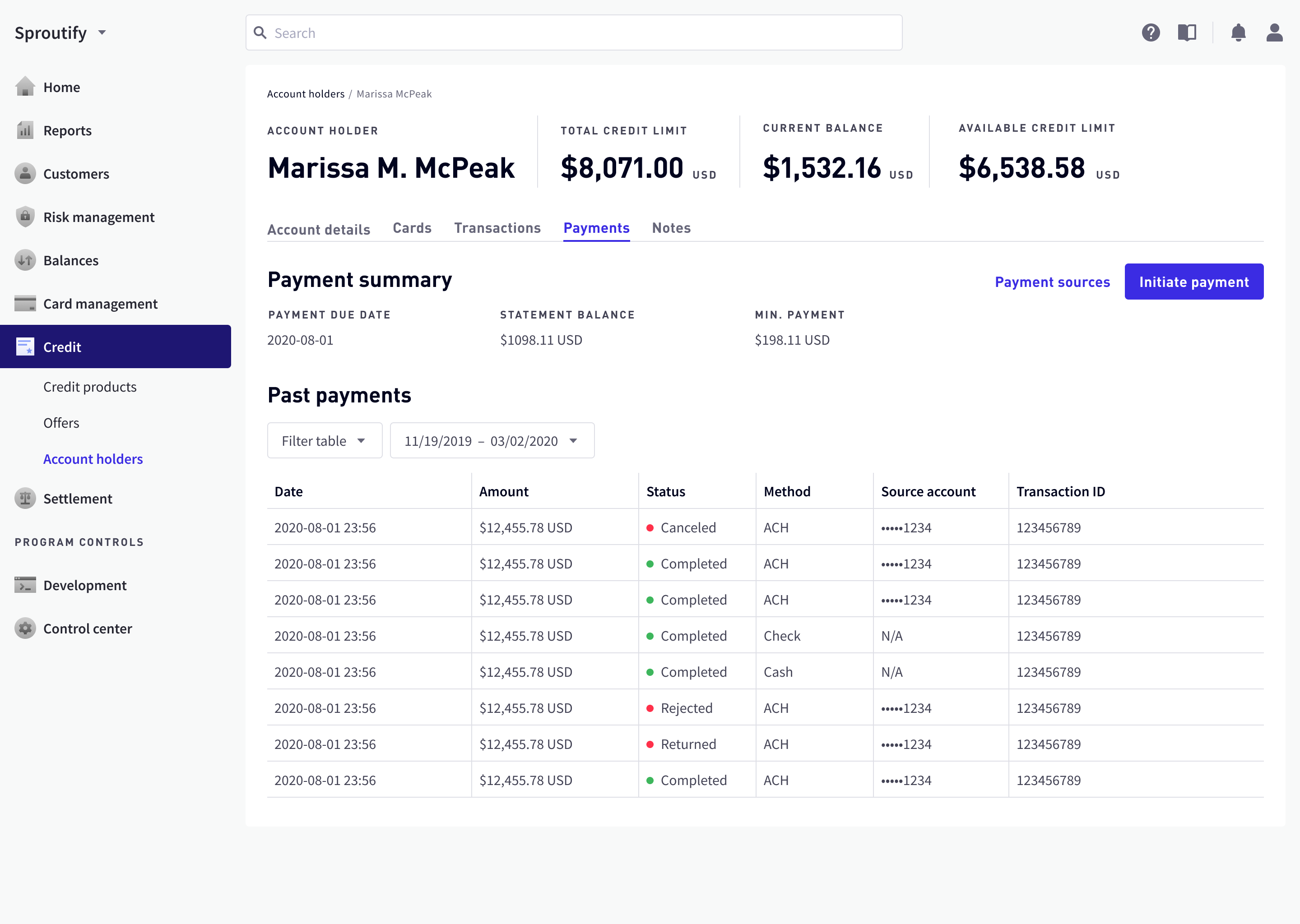
System Consistency Won
Just as I thought we were finally nearing hand-off, this amended design faced fierce challenge from one of the design leads, who might not have known the full context of all previous design decisions. He simply went, “agents get so used to reading tables—why can’t we use tables for the recent payment transactions?”

I conducted a quick user interview with the target users, and found out the gap between my assumption of primary user tasks and the actual primary user tasks:
| Assumed priority | Actual priority |
|---|---|
| View, Cancel, or Refund Payment | Initiate Payment |
| Payment Summary | View, Cancel, or Refund Payment |
| View or Remove Payment Account | Payment Summary |
| Initiate Payment | View or Remove Payment Account |
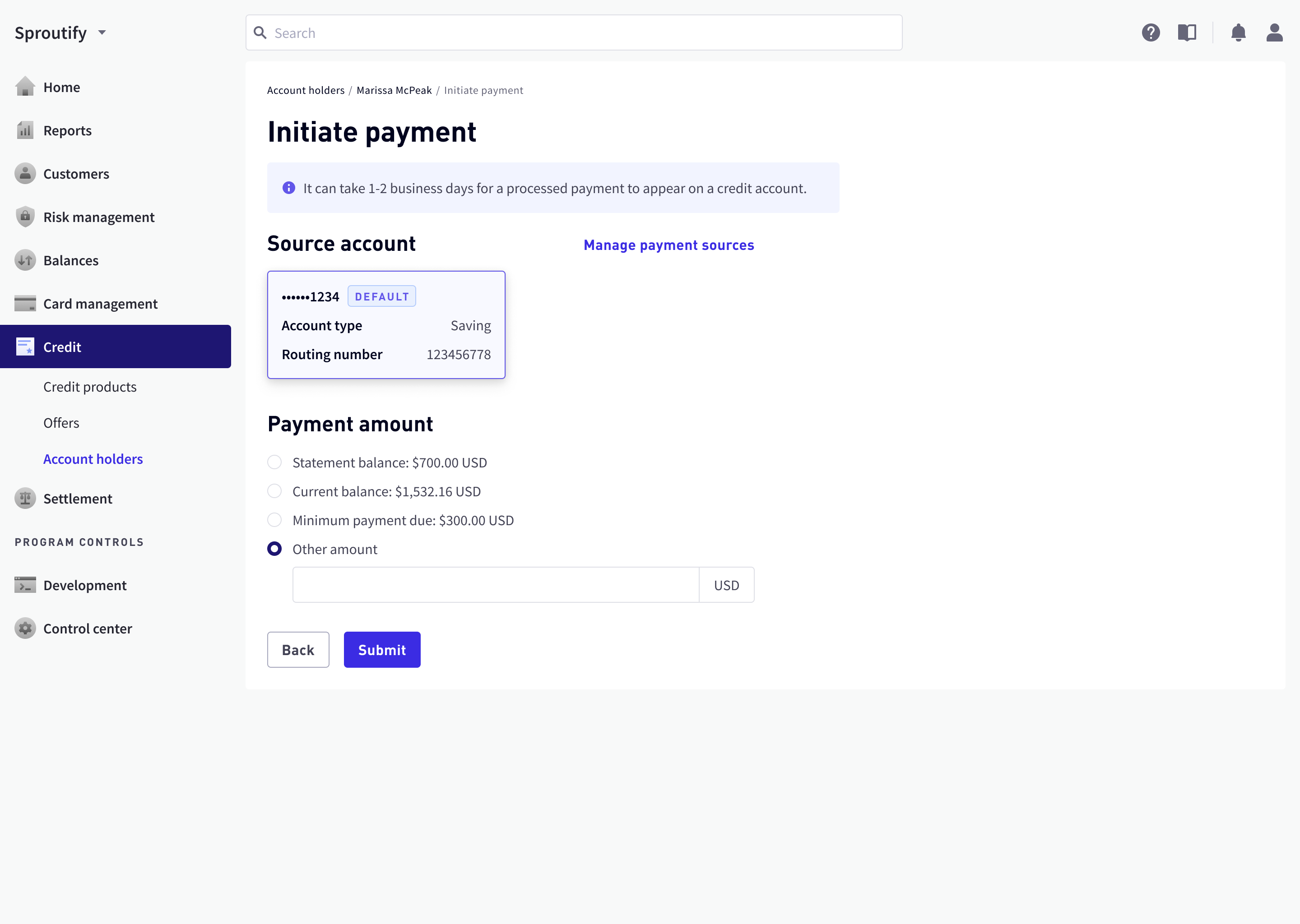
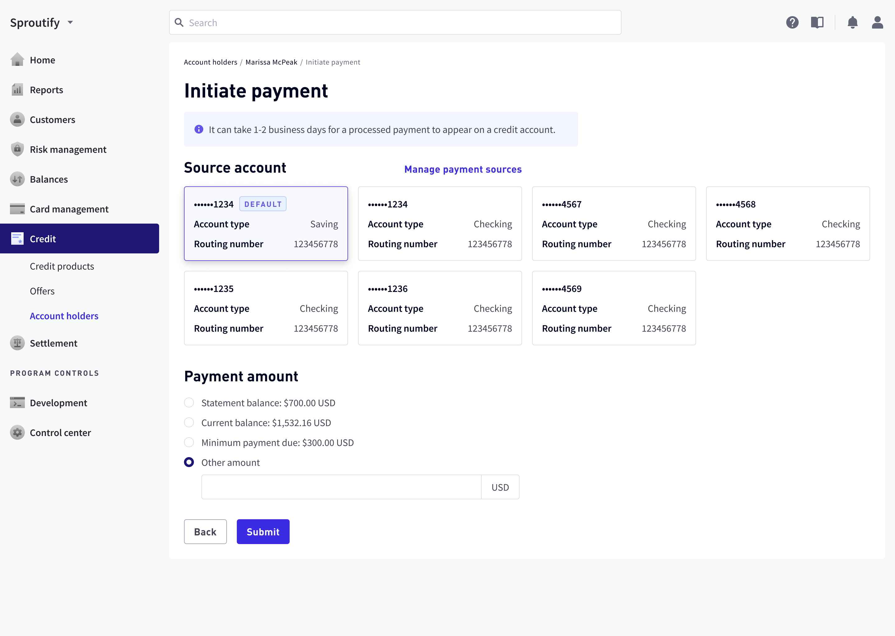
I proposed to host payment accounts in a separate page and use a secondary button linked to it from the landing page.

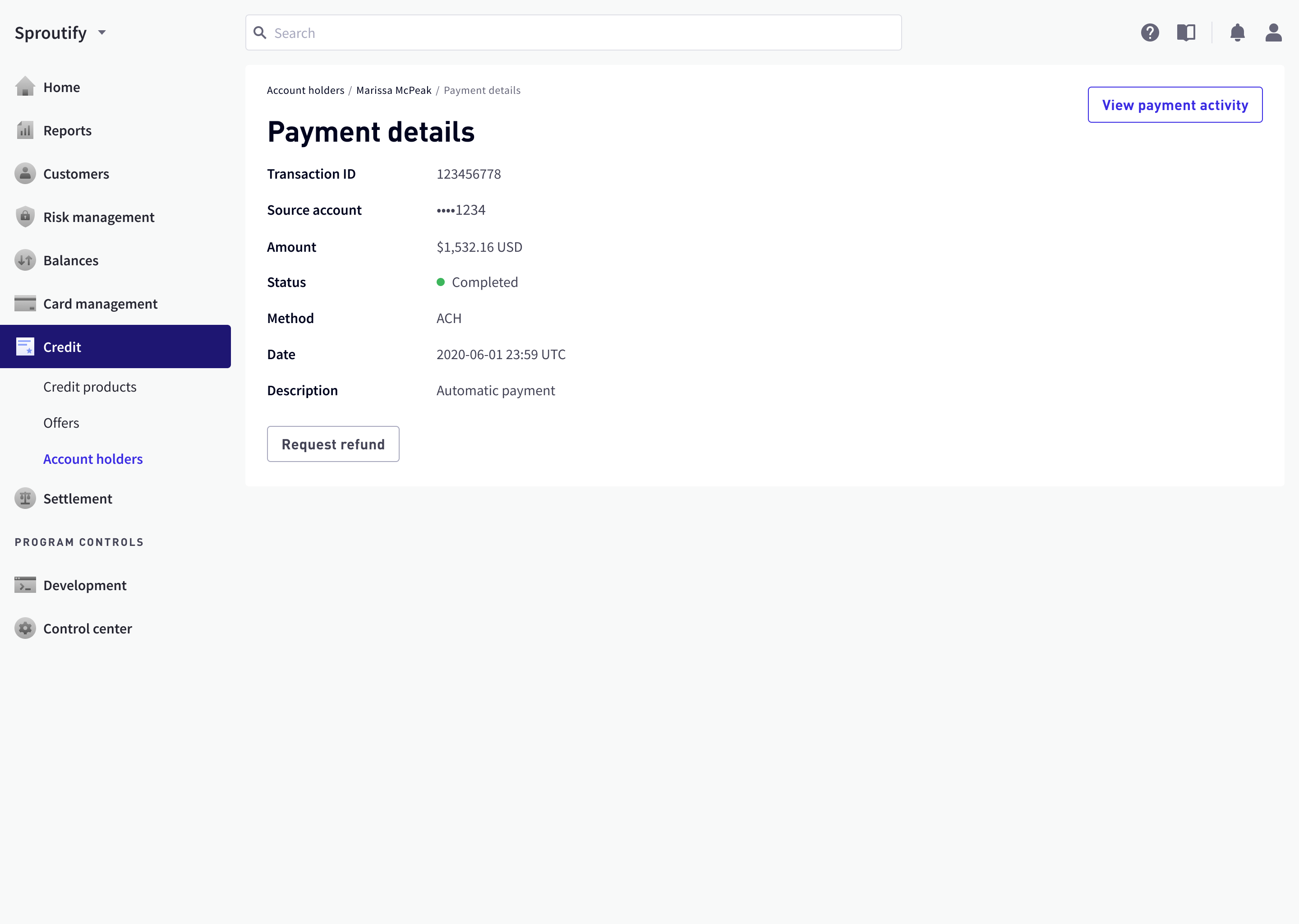
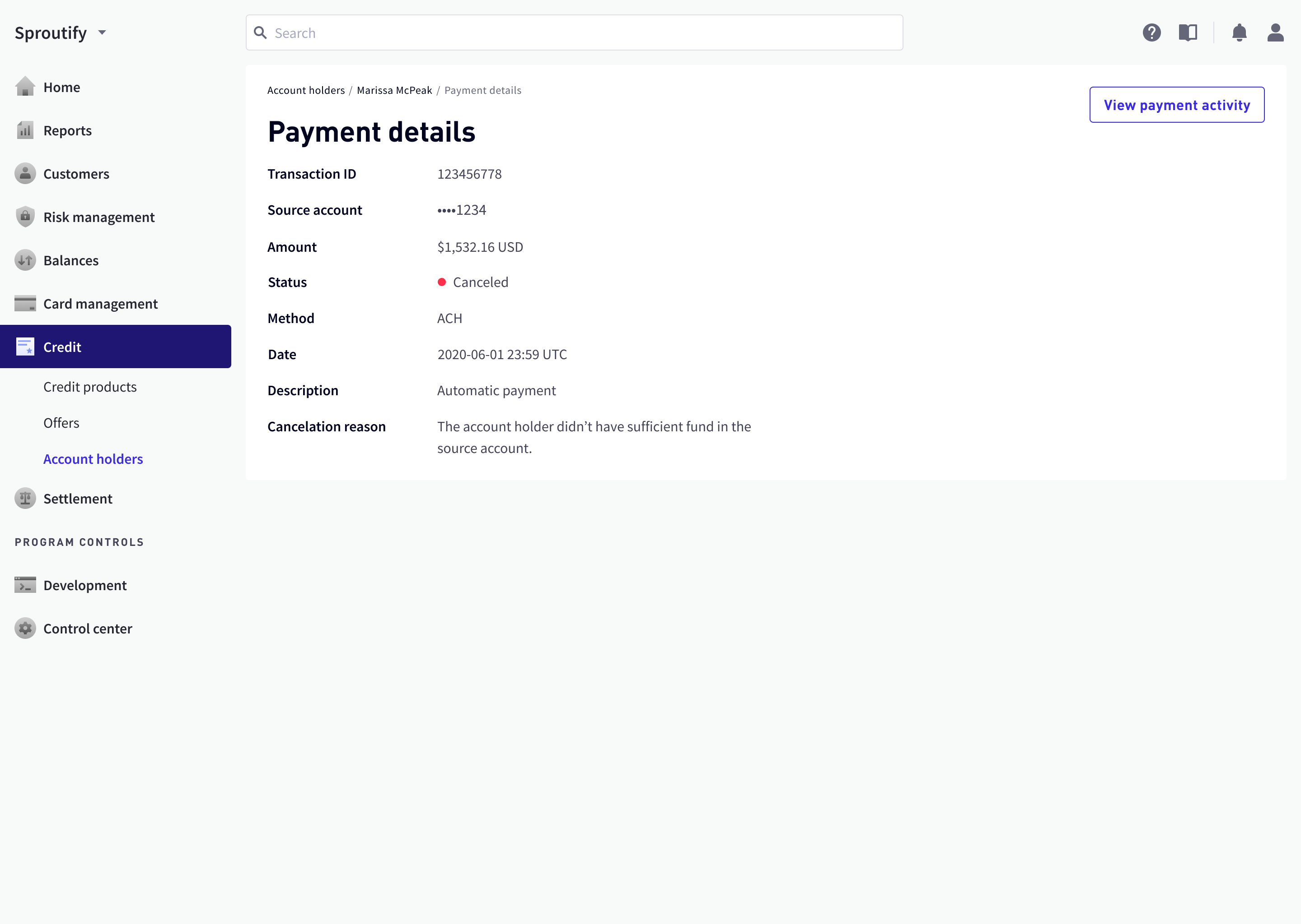
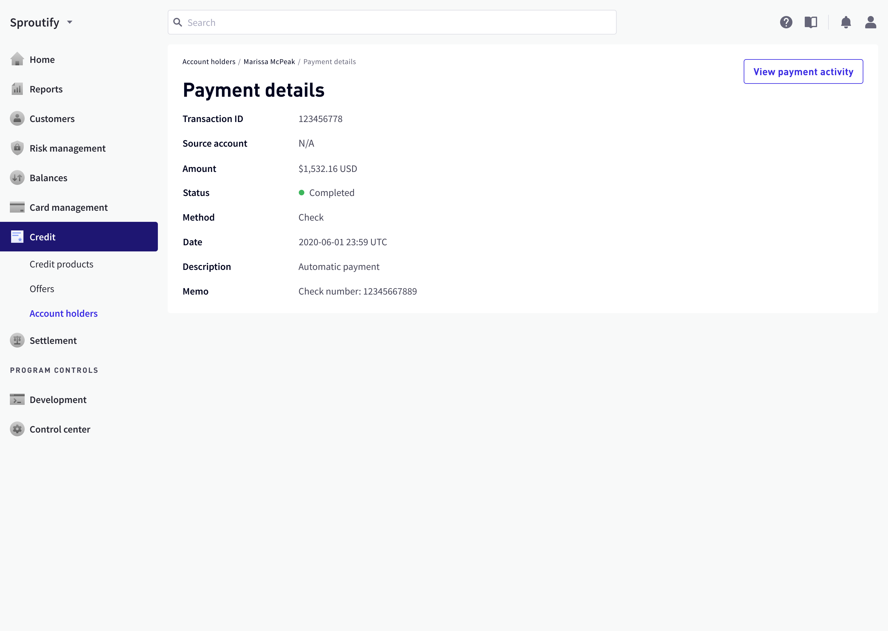
Payment Detail Page
Payment detail pages were now needed since tables are back in place. Modals couldn’t serve the same intention of assuring information accuracy when cancelling or refunding a past payment.


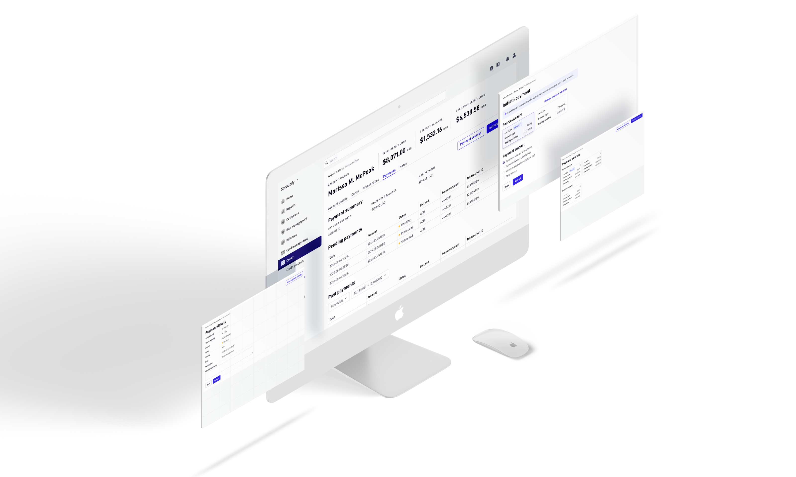
High-Fidelity Design
Since I mitigated all of the risks during the low-fidelity phase, the final design mockups moved forward smoothly. Click here ↗ to explore the Figma prototype.
Conclusion
Designing the payment feature gave me a precious lesson: in large groups, design is often more than creating artifacts, and heavily involve communication, trade-off, and compromise. For a small team, artifacts usually mean the end of design; but for a large group, artifacts are often only the start of the conversation.